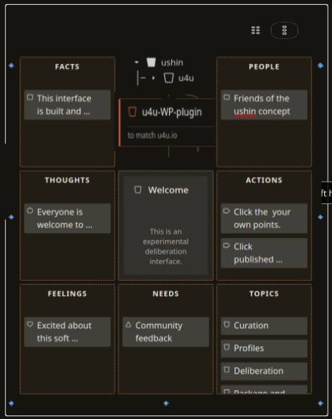
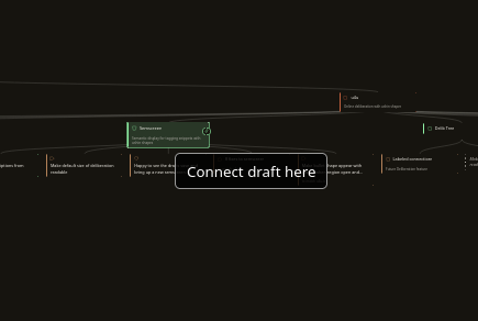
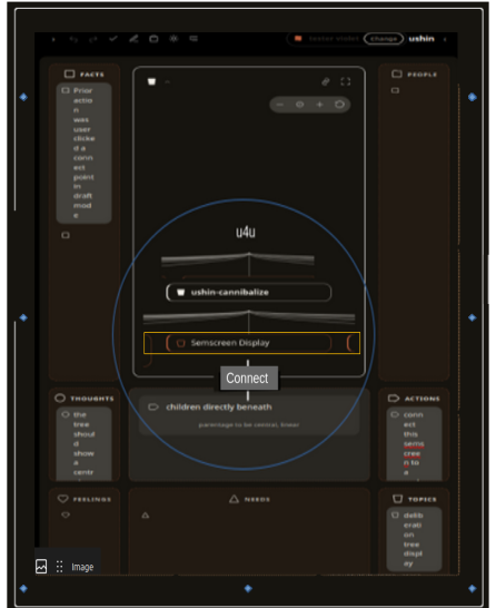
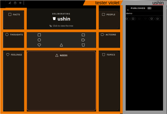
This page shows example deliberations using u4u: online deliberation with semscreens.
It is also a showcase for screenshots and design deliberations while the tech team is still building an mvp for its own use.
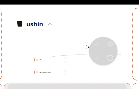
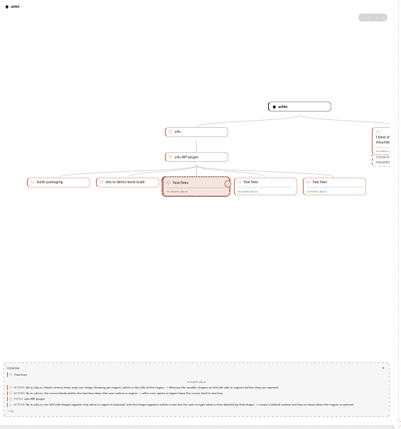
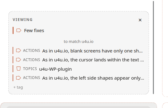
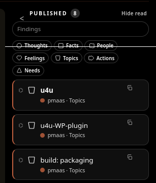
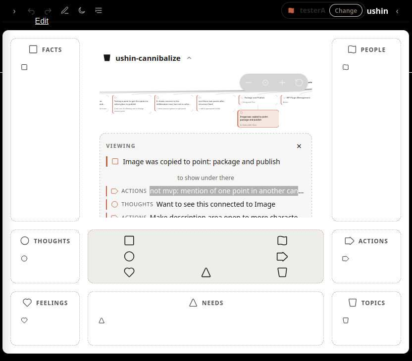
We plan to test the plug in several websites. The first, a currently deliberated u4u WordPress plugin, has the most activity, and is hosted here on this site. The second tests the plugin on a music collaborative website. The third, a p2p browser app, is backburned pending the completion of this interface. The fourth, a browser app to annotate with ushin shapes, is a promising example of u4u under consideration.
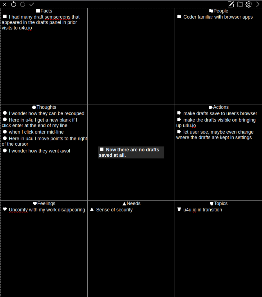
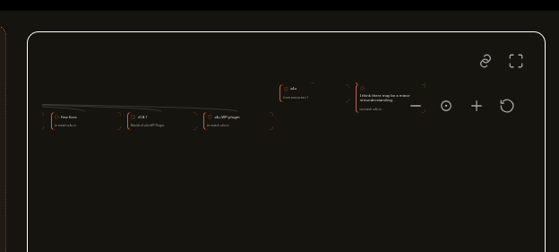
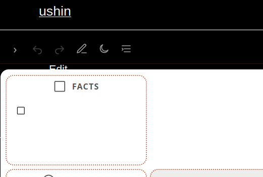
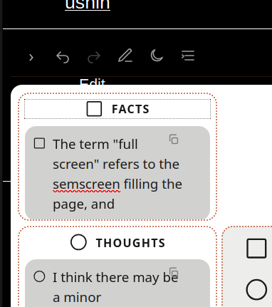
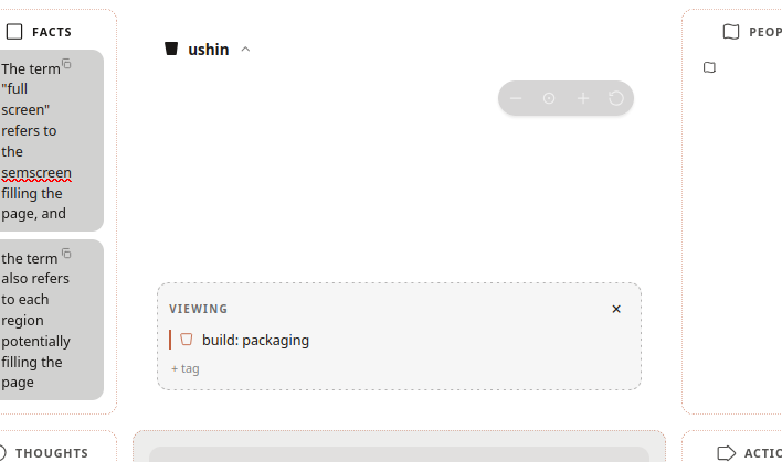
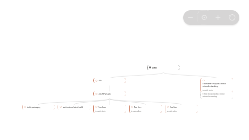
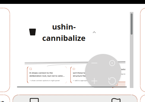
The above shows what is left of a previously working p2p browser app. Currently it doesn’t save work locally nor publish input nor provide a url.
Sample deliberations
The following mockups and concepts are parked here pending a stable semscreen.
Most issues are handled on the issue tracker as they do not merit deliberation.
Mockups are drawn and pasted from current and past screens and mockups.
TO BE PASTED INTO ushin.org/u4u-UI
EXAMPLES of RECENT/CURRENT DELIBERATIONS
Deliberating neutrality
USHIN, Inc. and the tech team have been using the git repository, Sourcehut, as our way to communicate feature requests and bugs among the visionaries and coders. Recently we became aware of significant controversy surrounding the company and are deliberating our options.
Deliberating a u4u WordPress plugin
See dev.ushin.net/semscreen a partially interactive archive, to browse and create semscreens that save only to browser. Buggy, being rebuilt
Soon to launch semantic screens:
dev.ushin.net/u4u-UI – new page for building the deliberative tools, after which the site may go through read only until mvp built
– dev.ushin.net/u4u-2-cannabalize – the old u4u semscreen renamed, for gleaning to create the UI deliberation, also hidden till mvp ready.
– dev.ushin.net/semscreen-2-cannabalize for /u4u-UI
This page as a dumping ground for current and upcoming builds.
-> CURATOR creates new tags by adding to ones own semscreen
-> those tags show in user drafts (and those selected by user show in packaging)
-> LATER: tags also show under search bars per filters created or selected by curator
-> tags are set by curator adding semscreen to anywhere and those tags apply to branch until new tags are created
-> tags may be removed by curator (later feature: user to personalize for their own categories)
-> tagging branches will make them easier to leave in place in the original delib and filter for tagged results
-> tagged branches can be copied, moved, and hidden by curator
Note: beyond personal cataloguing, tags help other users find specifics.
PAULA TO DEFINE THE PROMPTS, WHICH SHOW DURING SEMSCREEN DRAFT & PACKAGING STEPS
Tag search
Connect two tags to create an labeled edge.
When user selects the editable label there are linking phrases, other options, per curator, as hierarchical tag clouds.
Users and curators share their tag cloud packages.
e.g. connect similar branches, e.g. “tags” which occur in both trees.
Semscreen displays
One open semscreen by default in draft.
Tile two open semscreens in draft, packaging and curating, moveable.
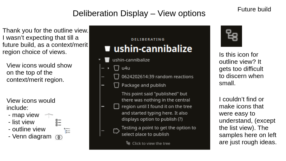
Outline button to tile two delibs in outline view.
Comparison and revision tools, like deduping.
Click point in delib field to open semscreen within delib field.
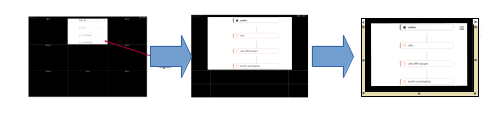
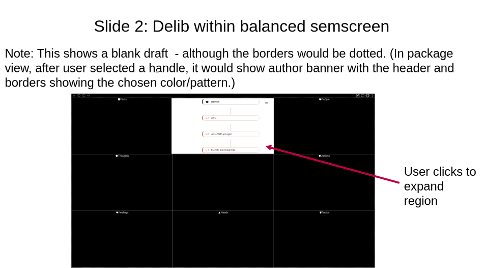
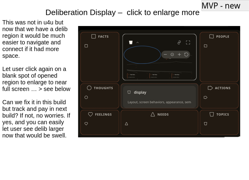
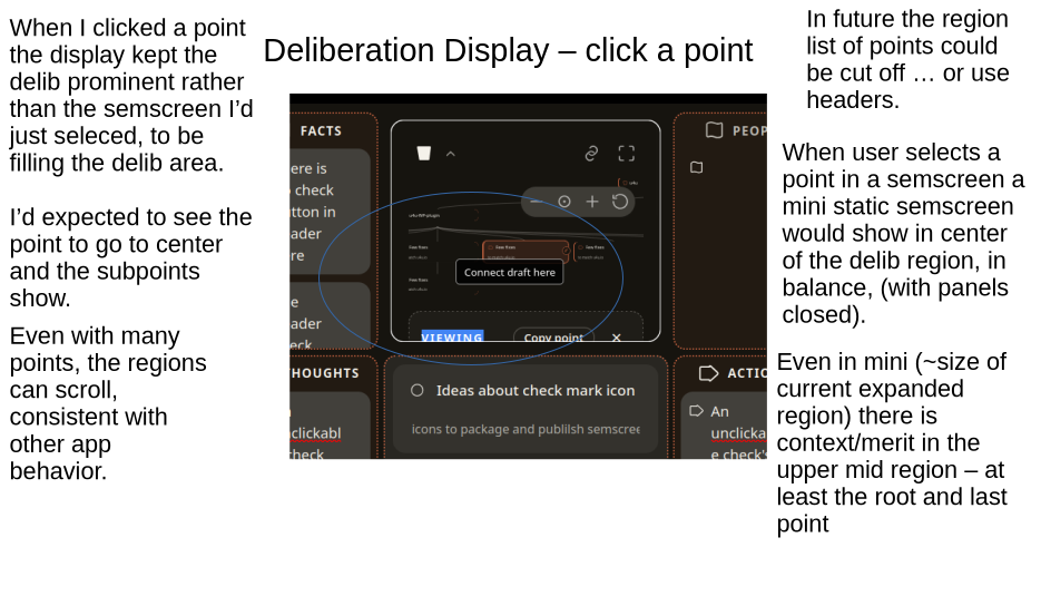
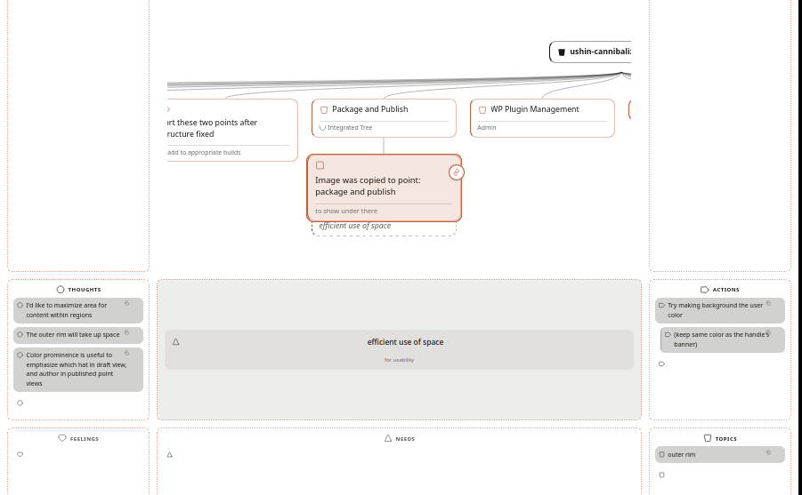
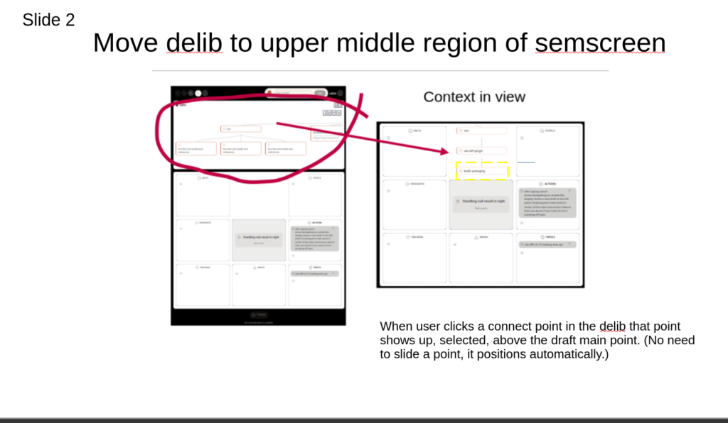
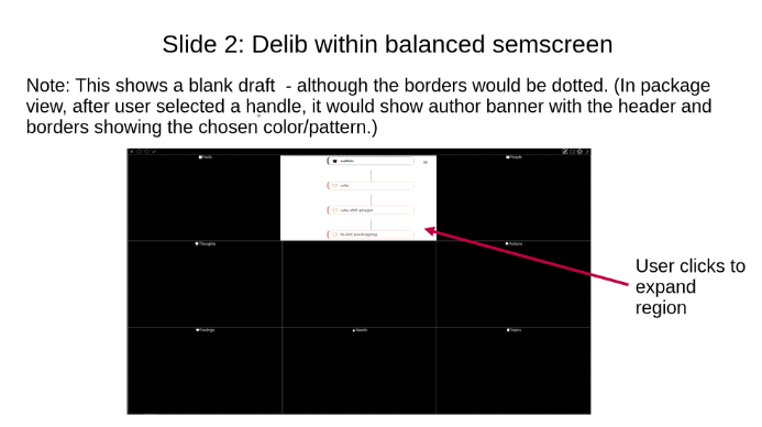
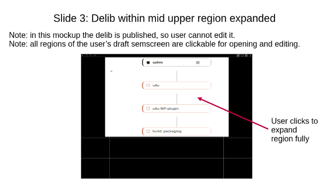
The following mockup shows a balanced semscreen with selected point opened in the delib area. The point is to show reason to make default for opened delib points be enlarged, not balanced, which is otherwise the default size.
Ignore all but the small size of semscreen in delib area when the region is in balanced sizing.
List or outline view of semscreen data sorted by shape, date, author, keyword
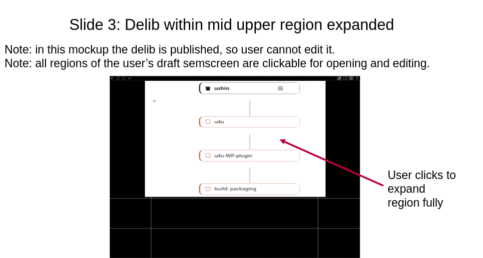
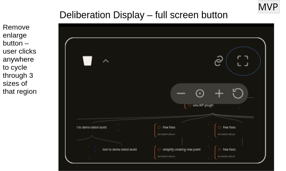
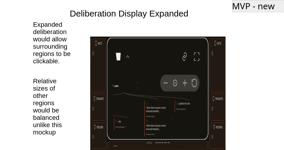
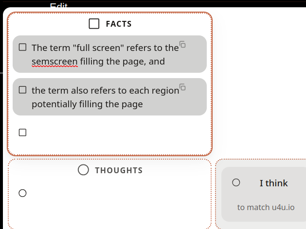
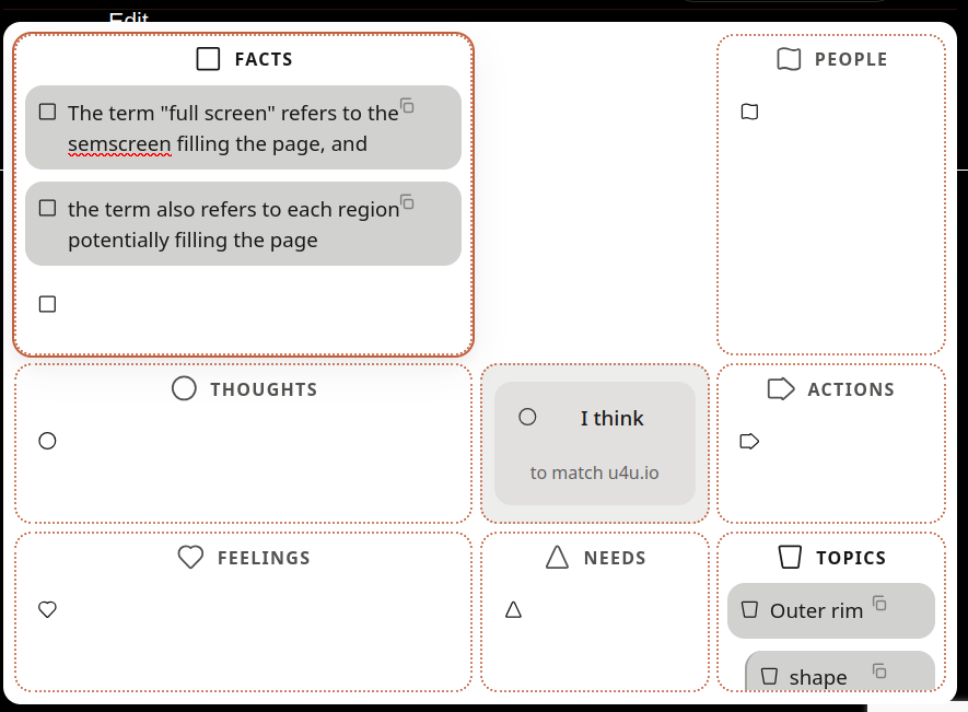
Delib fullscreen or almost full
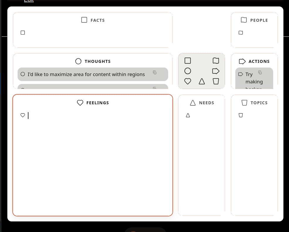
Select Delib main point to open semscreen in enlarged draft area, by default taking up center screen with ~60% of real estate, with draft pushed to the sides, in outer rim with miniminishapes, or hidden, accessed by L panel button.
The default relative size would be the smallest readable
Filters
Collections of tags, delibs (or parts of), peers to narrow findings and curate content and protect from spam.
Packaging
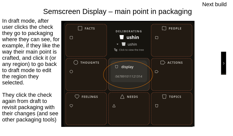
Users should be able to save semscreens without lock-in to read them. After clicking “connect” (maybe better than “submit”) the user has options for handling their draft semscreen:
connect through host – pending files (see requirements, below)
share over compatible channels, P2P (?Pear), fediverse, soc media, nostr
save to computer in choice of formats (?) [later, save branches and delibs]
save as ushin-annotated text file or doc
save as .ush on one’s own db to open with ushin tools elsewhere
others, .mm, html, .pdf, microblog, blog post, RSS, non-compatible soc.media, open into email
Note requirements to open packaging screen are completed in the semscreen in draft mode:
user’s draft includes a main point,
the user navigated the delib to place mainpoint to sit just under a published point in the deliberation, considered the connect point, or connection.
when user begins a draft it is by default pre-connected to the last point opened in the delib tree.
any input into the facts region requires selecting a tag
Facts valuations include information source ranks and
Unlike other shapes, the default packaging mode includes an expected, if not required, tag to show kind of source of information to validate the fact, with link if not self-sourced.
Descriptions are displayed when user selects the region header, in this case, facts in the facts region. Description of what is accepted by the curator is on display for users at that site, in addition to the kinds of facts. In our examples, this reads: “By default, facts are described as evidence, events, completed actions with a date, place and unless self-sourced. Unless self-sourced, default requirement for facts to link to the reference.”
Note: expected outcomes of actions are not facts but thoughts/expectations/assumptions …
Facts,
date
place
self: personal experience
other: second, third hand (hearsay)
published source/link
type of authority
e.g. peer-reviewed journal articles with specifications and merit rank set by curator
others … to be created by curators e.g. the Imbue project requires users to label and specify their source of information. (Imbue example to use self as respected source, or set no criteria)
the default source tags shows selected, “self” as source
when user chooses another tag the default auto un-selects
PACKAGING DISPLAY
-> when user starts to edit anything it reverts to draft view
-> “i” for “help” [not ?] prompts:
“Try different points to see where your input best fits”. “Try different shapes to see what fits your input”
future: screen video showing these behaviors with example
FUTURE Display: rather than move the delib to settle over the current draft-on-its-way the user DNDs the closed draft-on-its-way to hover published points of the delib. When hovering that potential connect mainpoint opens to display point’s subpoints and images in a semscreen. User can release to view their draft-on-its-way with this packaging step to see how it fits while able to back out and can move over the delib to try out the best spot before commiting by clicking one of the options on the right side of the screen. In this display type when user clicks connect the cursor shows on the closed new mainpoint–on-its-way ready to move over the delib, and on release the display shows the eonnect and new point as it would look after publication but with dot-dash border
NOW the display requires the delib to move, which is awkward. How much of a change would it be to build the FUTURE Display described above?
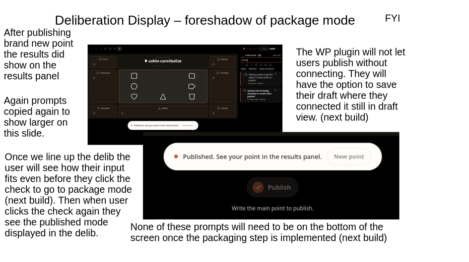
The connect button is OK within the screen but the publish button is out of close range to avoid inadvertently clicking by err.
When user clicks the connect point the packaging screen shows the draft, dotted border, in the delib with main point big and center-bottom so that there is room for the delib above.
-> The deliberation tree with the connected point open (all regions showing)
-> the draft view disappears (can be regained by opening left panel)
-> the user’s draft-on-its-way appears with dot-dash borders in the semscreen otherwise as it would appear after publication
-> user-editable connect button withe any curator recommendations/limits as labels (required to publish the site, however user can export, share ..)
-> to retype points or change shapes or tags user clicks back button to find the draft, with dot-dash edge showing on top of list of draft panel (recency = default order)
-> the right column shows middle field
TESTING PACKAGING
1. deliberating/ushin.org/deliberating u4u
2. semscreens/imbue.im/songs
3. semscreens/
Curation
Parameters typed into the curator template semscreen regions show up in public view as user options within those regions.
-> Rename Labels = Curator will select the connect button, have it show as a main point in a draft with cursor ready to edit the label. The action region has buttons: move, delete (moves to trash and backup trash), archive (moves to WP db)
-> Curator sets the options for user to see in semscreen
“connect” labels (or curator can leave that open for user creation)
curator can change anything but lets visitors know
PAULA DECIDE IF CONNECTION LABEL IS PART OF PACKAGE OR SET IN DRAFT
If in connection, that is the main purpose of having package view for user contribs to delib – as though seeing the type of connection from a higher perspective than the content and tags in semscreen
-> When connect field is selected, the field expands to show tags previously suggested by the host, and any default tags (e.g. for feelings, needs and types of thoughts…)
-> Markers of altered deliberations show on public view with way(s) for viewer to trace steps back
-> Curator can shuffle whole semscreens to reorganize delibs, add new points that curators publish on one’s own hosting.
-> Points retain their connection to original points with address of original host with link to original spot of publication.
-> deletions of user points and semscreens are displayed as curator-semscreens describing the deletion itself as the main point.
-> permanent deletions, after at least a curator-main point link in its place, (listing those guidelines among the specific) and the point itself moves to admin-access db, not public, and can be deleted by admin and in so doing the plugin displays link to main point, e.g. thought: inappropriate; e.g. feeling: uncomfortable
-> Curators who retain the right to permanently hide user submission parts or whole describe this prerogative and curation/moderation guidelines
-> default shape labels, +/- descriptions to customize – see website for feelings, needs, thoughts to add within shapes (first 9 categories, then when user selects on the other lists show as tags in alpha
Fact input requires information source(s) rank
Unlike other shapes, the default packaging mode, as presented by the Imbue prototype, requires users to label and specify their source of information.
Facts, (evidence, events, completed actions)
expected outcomes of actions
personal experience
second hand
from list of peer-reviewed journal articles
others …?
-> Curator suggests and even may require certain connection labels
Curators create, edit select labels
SHAPE LABELS are curator’s subcategories of each shape, as shown within the different semscreen regions. Imbue.im, for example, will offer users lists, e.g. feelings/needs/thoughts and also topics lists that are specific to Imbue, e.g. user-selected sections of songs.
Example connection labels
Among infinite linking phrases between pairs of nodes this list includes a few that might be a focus to support a specific merit valuation.
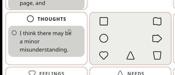
Neutral ushin deliberation software does not include set tags beyond the eight shapes and basic deliberation tools. Even the default lists for generic feelings, needs and thoughts are customized in packaging steps, before publishing. Sets of subtags and metric descriptions and schema are up to publishing hosts and users.
Notifications
Offer users options for how and when to be notified of updates
Instant notifications via email or onsite [later in-app] alerts.
Daily, weekly, monthly updates.
Notifications:
anything published to the delib
specific tags
author
Tabs
Method to display author tabs that user has accumulated to read later – these are not their own drafts, which are listed in left panel, but the gathering of other authors’ input, like webpages are stocked in a web browser.
Profile
? The IndieWeb wiki allows sparklines, a small avatar that contains your photo and your name linked to your user page. This means people can add a text snippet like {{your-chat-name}}
Sep 14, 2026
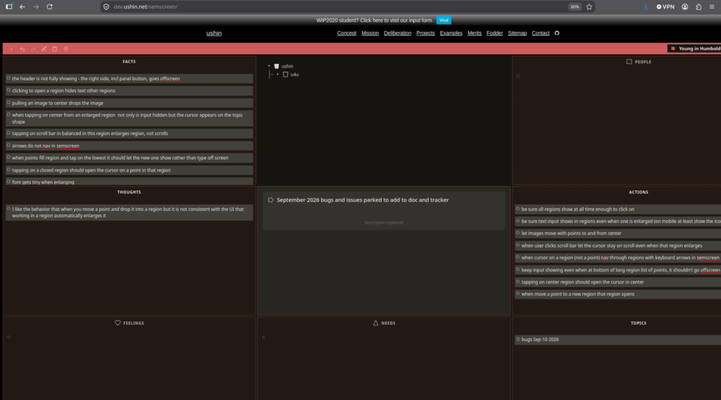
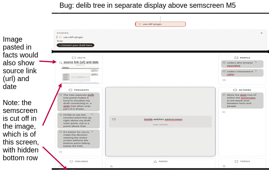
Current issues and bugs not yet on tracker, note screenshot was of fully opened screen, unusually foreshortened on the right:
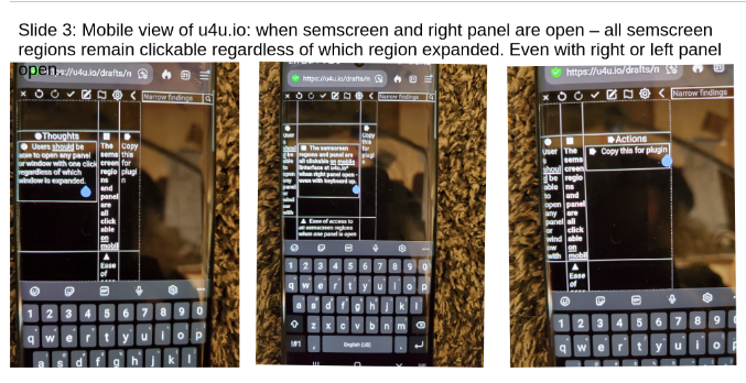
The following screenshot is of u4u.io showing all regions with readable input in balanced and also when one region is enlarged:
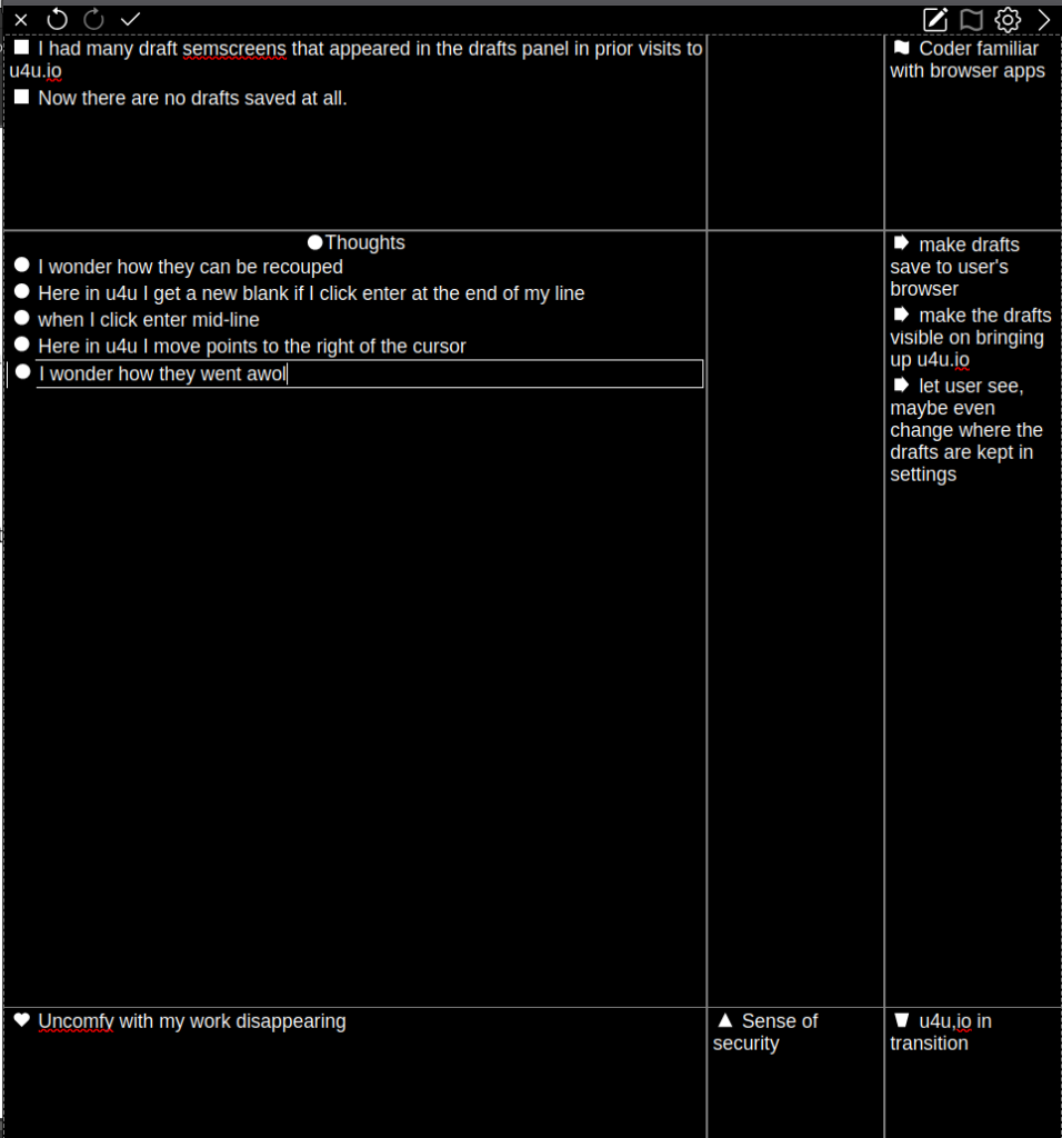
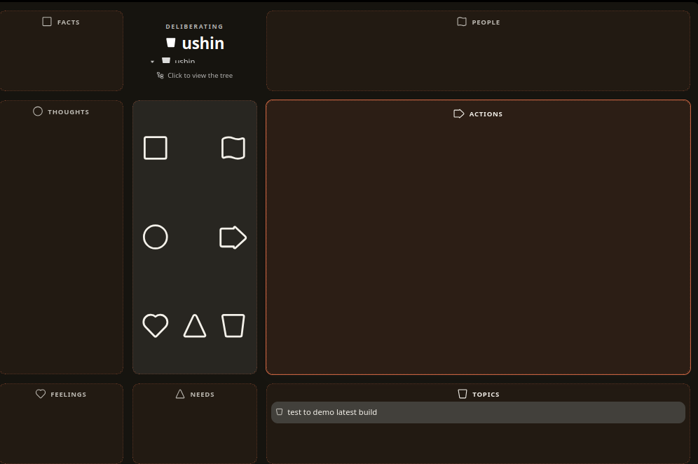
u4u.io – old browers app, half screen size, old content (disregard text, this is just a demo of how visible input should be)
All input visible, if not scrollable, when a region enlarged:
Aug 31, 2026
bug: – when I pasted text from this odt document into the semscreen is looked like this:
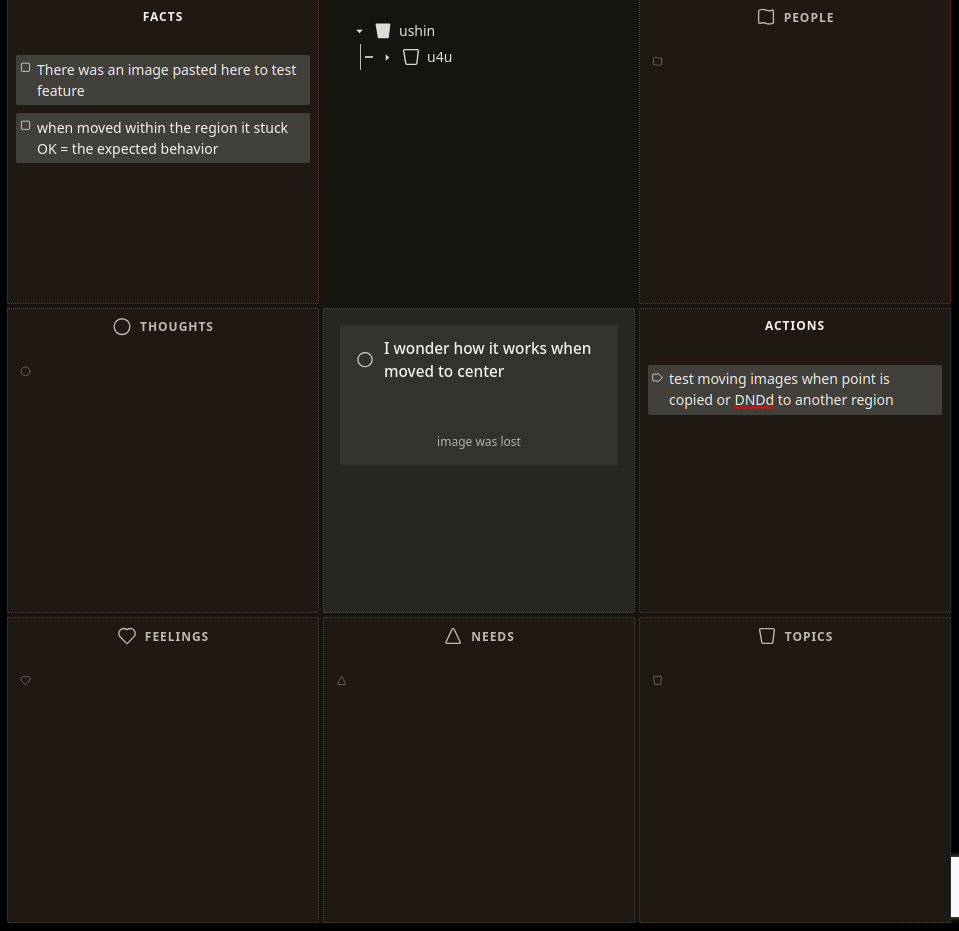
bug – Images don’t stick when moved, copied to different regions in same semscreen (and it should also stick when moving to another draft)
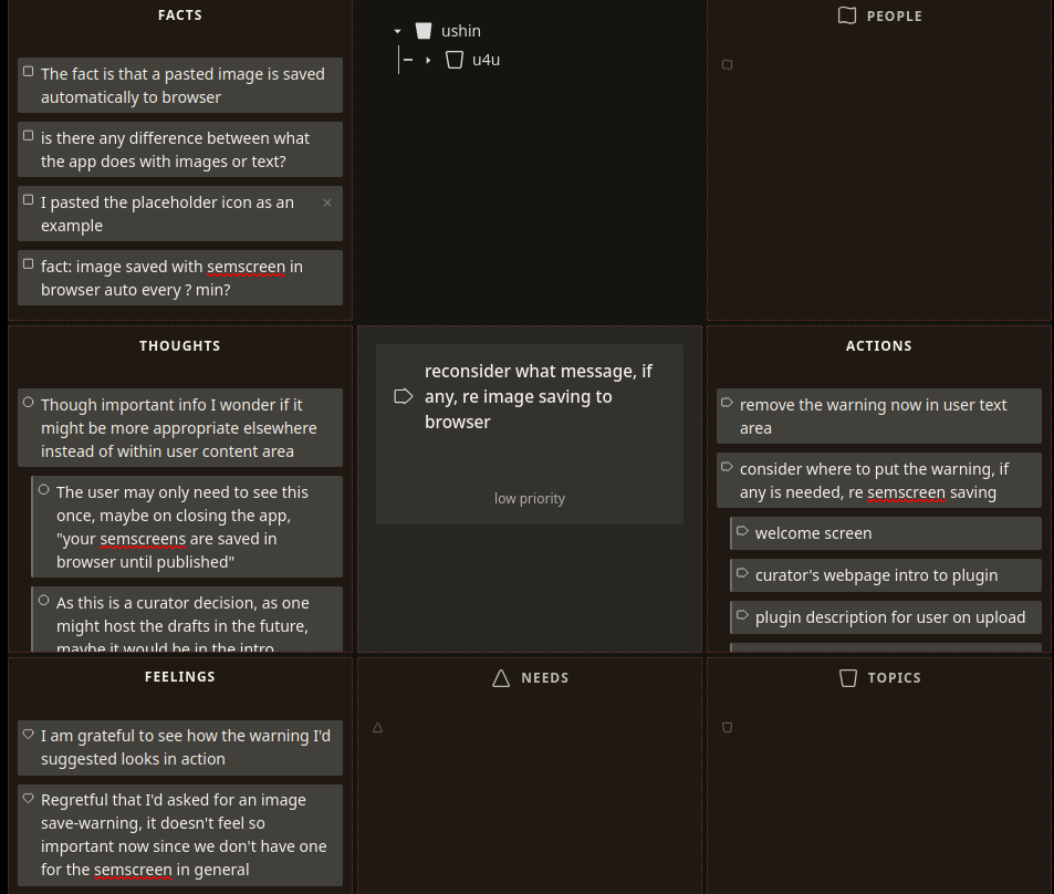
Does user need warning that image/draft is saved to browser, and if so where?
Aug 22 2026
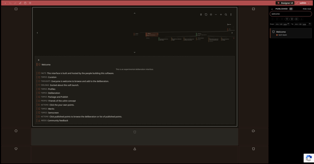
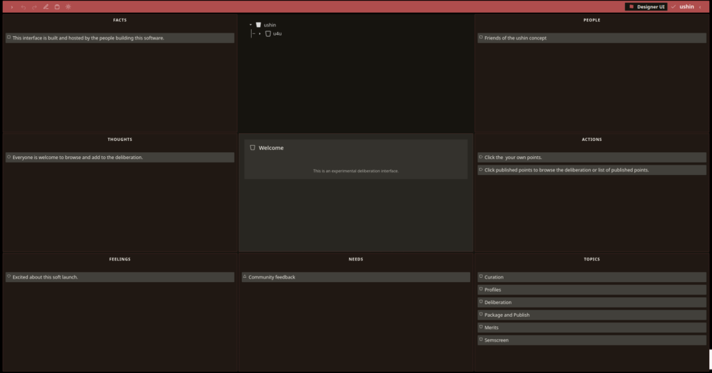
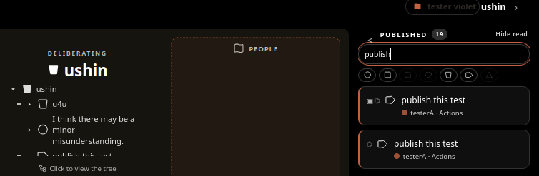
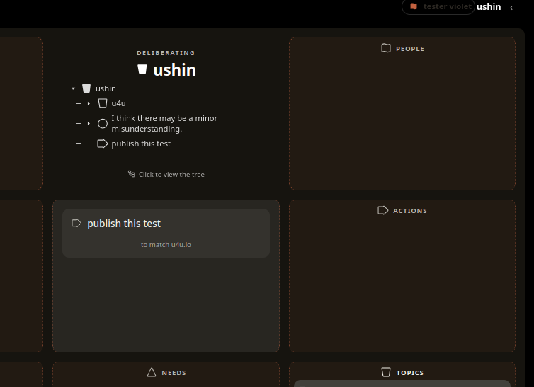
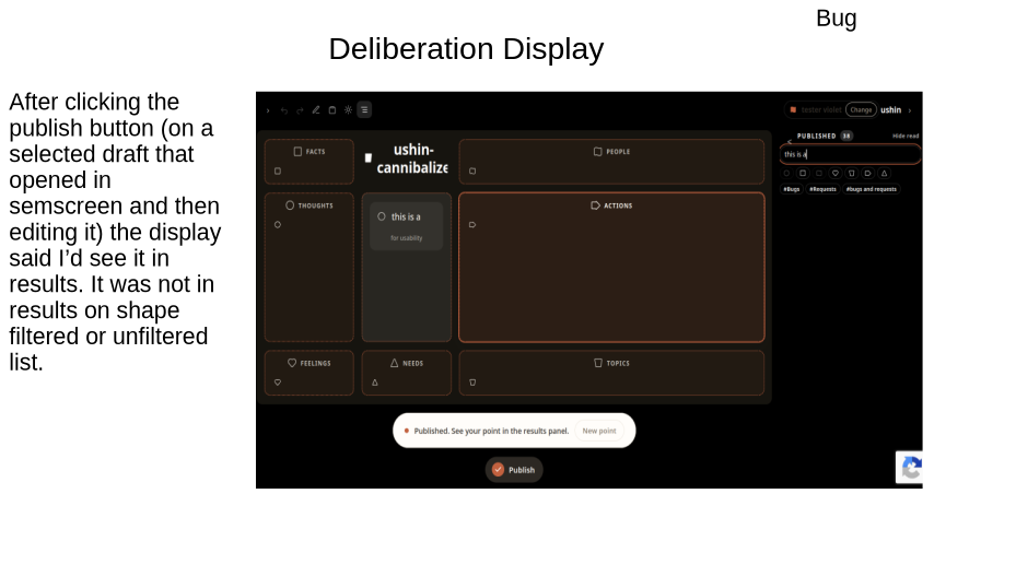
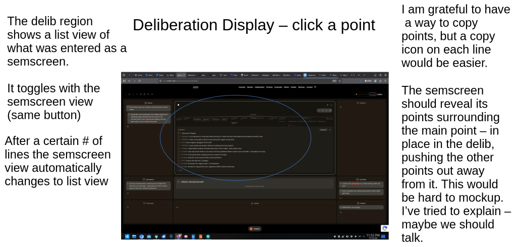
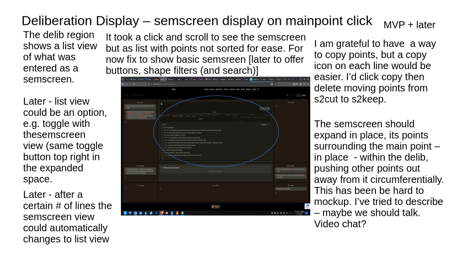
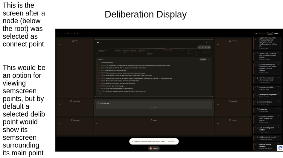
Show selected published point as semscreen in deliberation
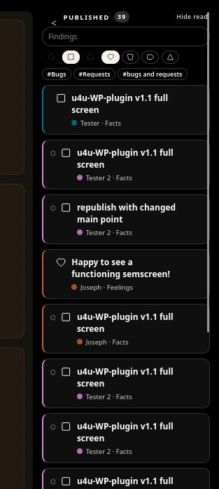
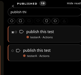
In current version when user selects a point in the delib that input appears as a list, not a semscreen. It would be less duplicating, simpler to read and more useful if displayed as a semscreen. It would be quicker, as now, to see the input content as a semscreen user opens R panel for host published points list and searches for the input:
When user clicks the input in R panel it shows up as a semscreen (good) but with no relation to its delib context within the delib, and the user draft becomes hidden.
It would be better to show the selected point as a semscreen in the delib area without removing user access their draft.
This requires:
more room in delib area to show a selected point as a semscreen -> create full screen view
user draft accessibility -> make rim view clickable
embedded semscreen in context in delib ->
Aug 15 2026
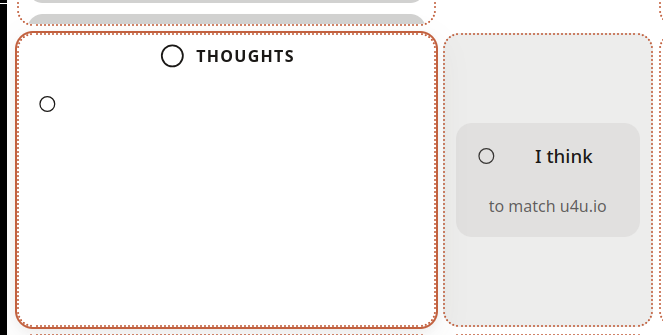
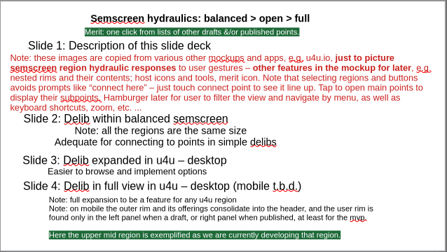
Considering 2 or 3 sizes for each semscreen region
Currently there are two semscreen sizes, balanced and expanded.
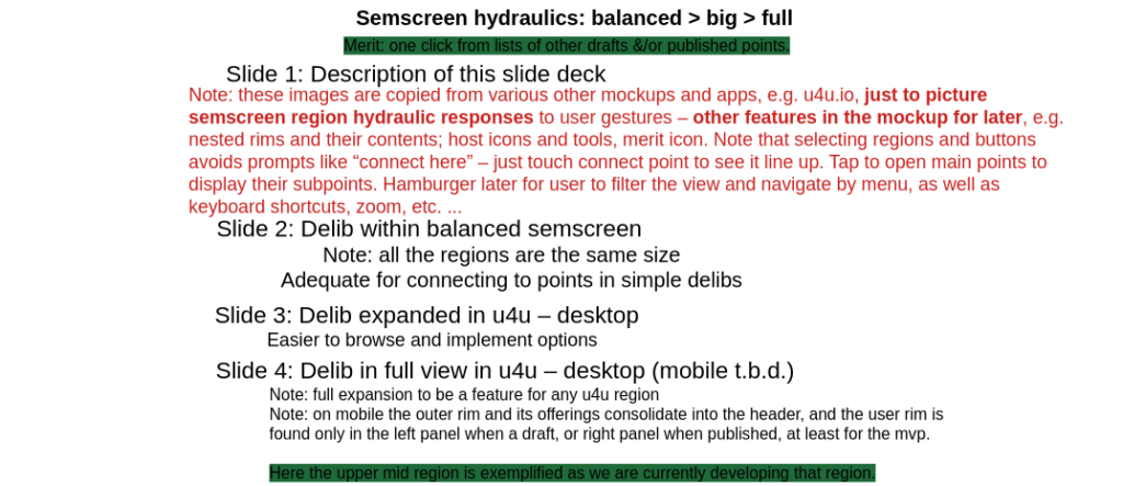
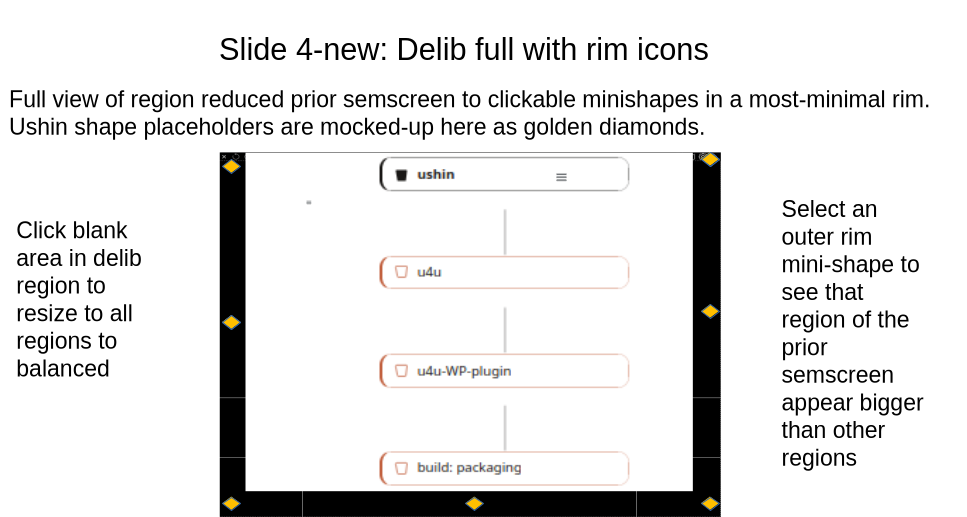
-> Test full region size, at least for the delib, with prior semscreen reduced outward to become mini-shape icons in a minimal outer rim.
Balanced click Big click Full or just Balanced click Full +/- shapes in rim
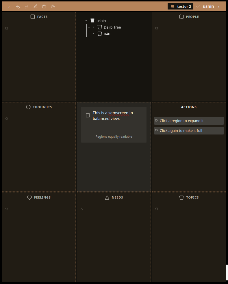
Balanced
The display shows input in any region of equal size.
In draft: the region outline would be dotted, not solid as shown. User clicks region hamburger dots to open the toolbar with cursor on last used button (?) and ability to scroll toolbar with arrow keys. User clicks blank area in region to open with cursor by minishape ready to type.
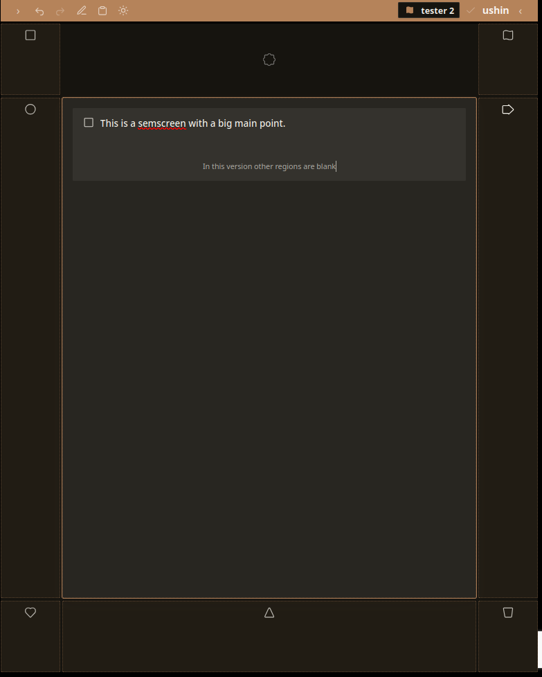
Big
There is a bit bigger than we’d tested before. Test this intermediate size just big enough to show many of its own points in the enlarged region but also room in the other regions to display points with shapes and text where there is input. Larger screens could show main points, mobile could indicate input with minishape(s). In this example the other regions are empty.
Full
The full screen has yet to be texted In this interface.
Shapes in the rim is a luxury allowing users to track the latest selected draft or published point and open a shape region of it in one click. (Compared with open one’s draft list loaded with one’s latest draft already open)
-> try clickable minishapes in the outer rim on desktop
August 6, 2026
Semscreen hydraulics – delib region
The following slides consider three sizes for the deliberation area.
Aligining whole semscreens in context of the deliberation
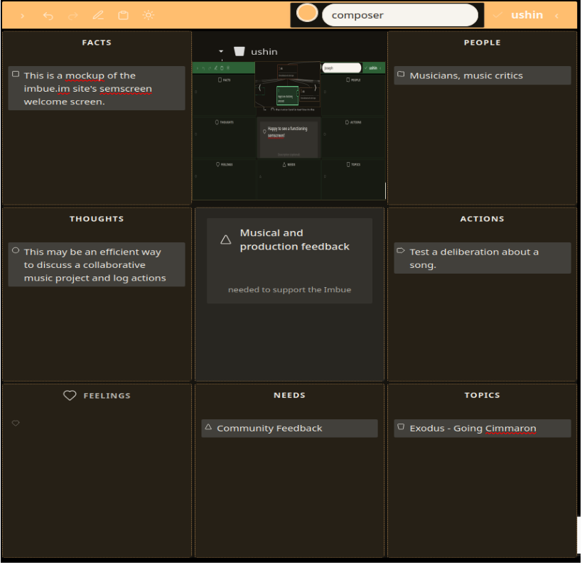
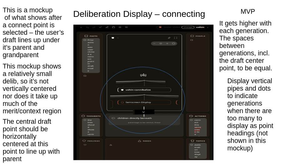
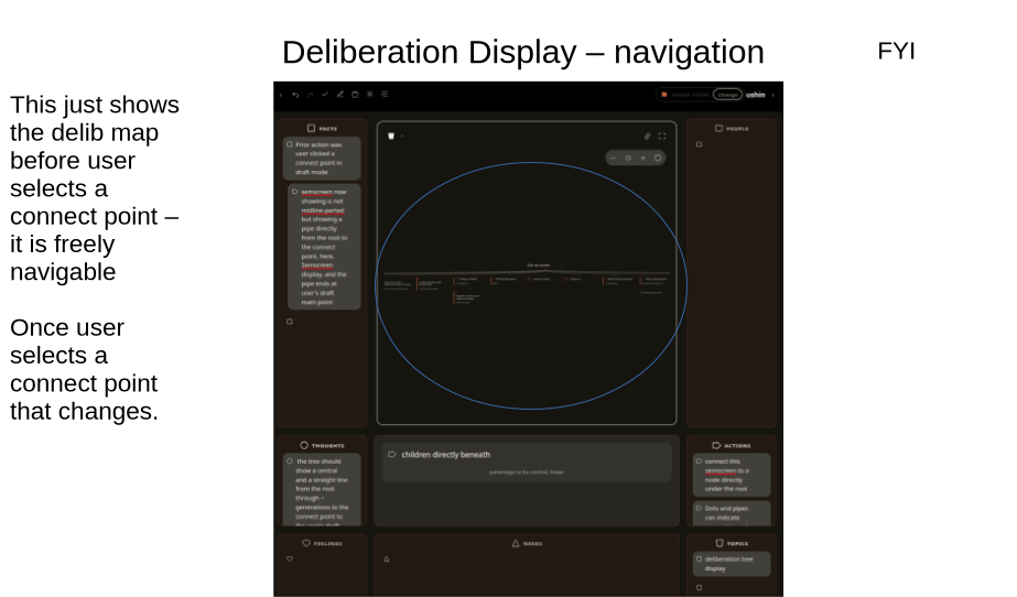
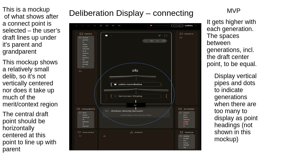
The rough mockup below shows an example published semscreen aligned with its lineage – how it descends from the root in the deliberation. In this example the published input is a welcome screen, showing its main point directly under it’s connect point (with byline) in context of the deliberation. (Ignore the content of the screen, alignments and many small residuals from the cut and paste process)
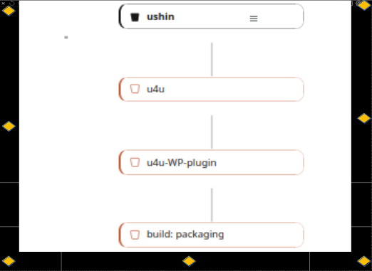
The blue dots in outer rim are placeholders for dotted draft ushin shapes:
August 13, 2026
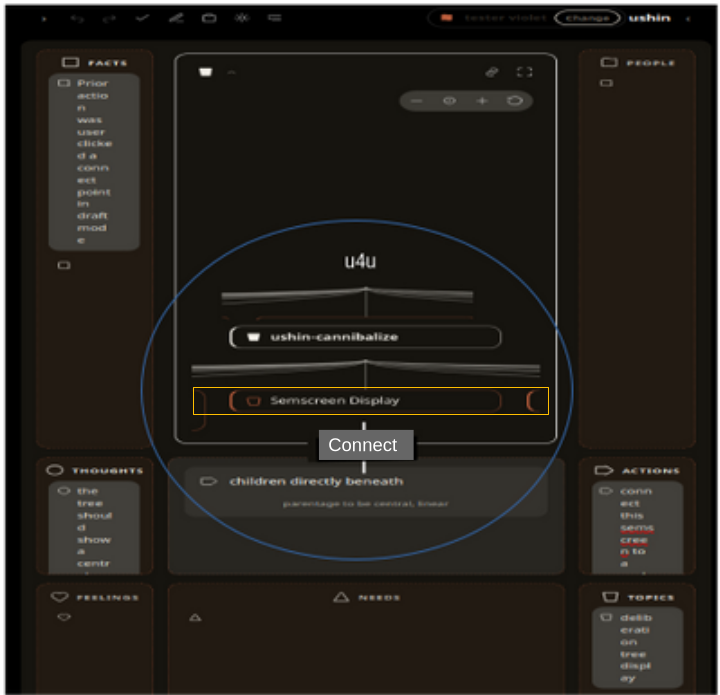
How to display the connect button
Currently the connect button appears on a selected point with a prompt.
The team is deliberating whether the connect button would be more quicker, easier and more intuitive for users if placed in line between the selected point and proposed new input.
Note: This is to show where the connect button goes when user is ready to publish a draft – which shows solid border here in err
The above mockup would be appropriate for a curator, who can shuffle whole semscreens to create delibs that curators publish on one’s own hosting,
[copied above 9-29] A userdraft would display dotted borders in the semscreen, in view of its potential context, (were user to click the connect button here, (which opens packaging). (image pending)
(potential view of outer rim – tabled for now):
The purpose of showing rim bullet shapes in full view of deliberation is both to encourage thoughtful participation while also giving the user plenty of room to explore and interact with what’s been published already on the subject.
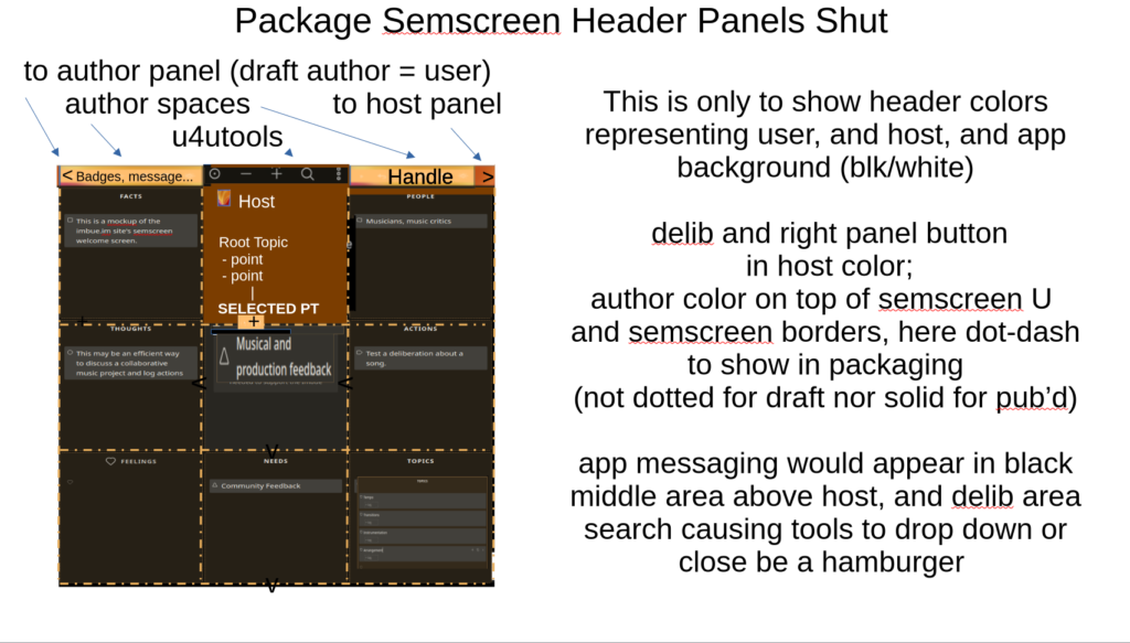
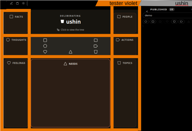
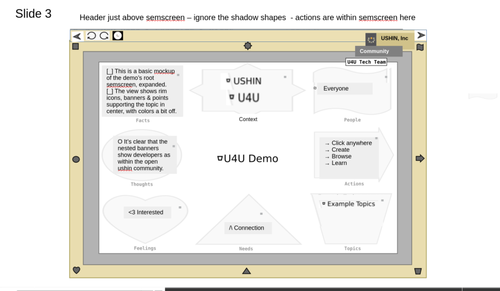
Author, host color banners and toolbar
Here the author is orange and the host is grey.
The left header, black here, is for app info and buttons.
The middle banner is the user name and semscreen color.
The right banner is the host’s profile, tools, filters, and published points.
Comparison How to display and which features for comparison, testing view of two outline-style delibs side by side for user to copy (DND) points between them, and for curator to populate new delibs.
Metadata
[host], author ID and color/pattern, delib subject, lineage and connect points are recalled, along with attachments, media, connections and connect labels..
Profile
Remove the color button by author to test clicking on banner itself for users and authors to access profile info and options, respectively.
Design
u4u.io style presentation of shapes in central region.
Prior issues
Some of these are resolved or proposed solutions have changed, so the following is just to give a sense of our progress, and use of the semscreen.
July 17, 2026
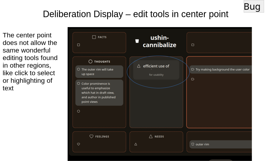
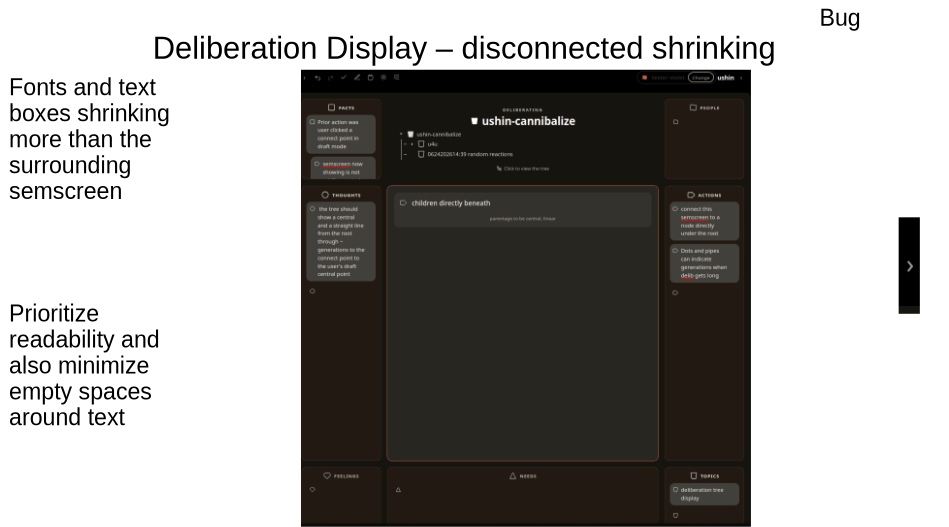
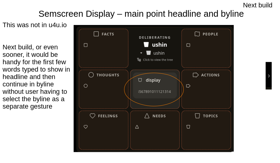
BUG: The central region doesn’t allow easy editing nor flow from headline to byline.
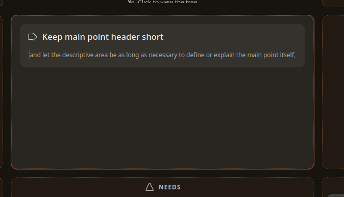
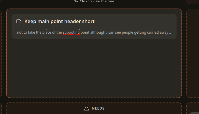
I’d like the cursor to skip to the byline after 20 characters or spaces typing in the header, so user can continue writing, with full editing like other region points.
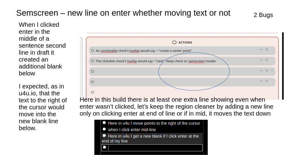
BUG – when moving points in a list there should be a move icon, like in u4u.io that lets user reorder list with the way to paste between 2 lines
BUG: Context in proximity IMPORTANT
-> Delib screen to respond to central point such that the connect point is directly above, not random
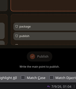
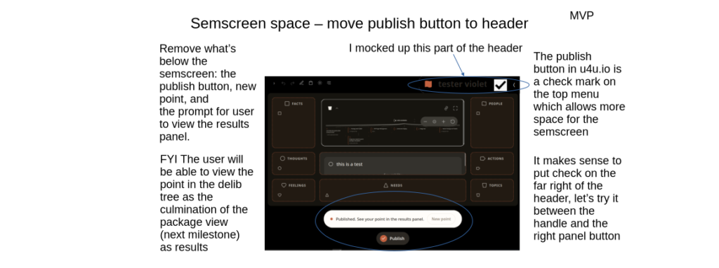
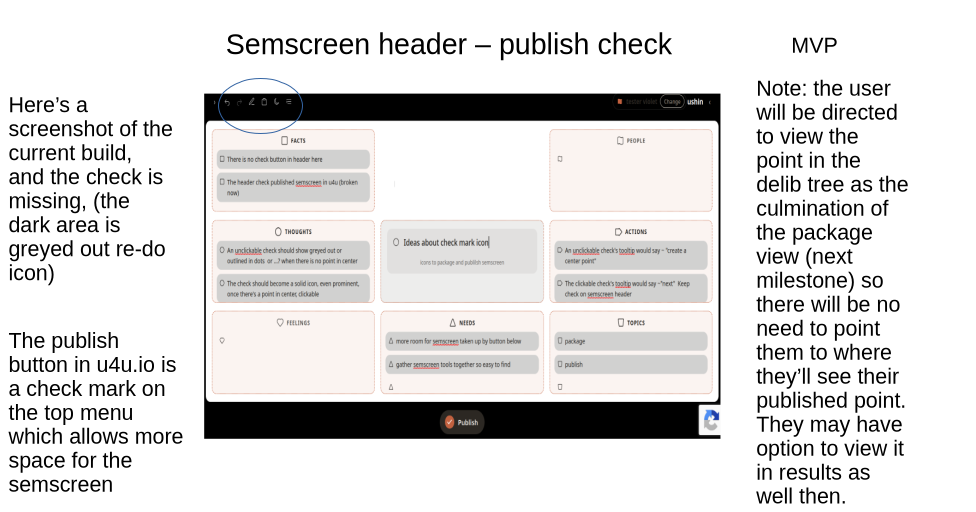
BUG: publish still at the bottom – to in header b/t banner and panel handle. Like u4u.io –
-> delete the button about writing to publish and instead have a toolip on hover the delib region that says, “main point” “drag a point here”:
Tabled – multiple semscreens as rims
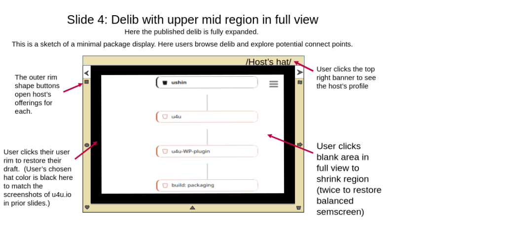
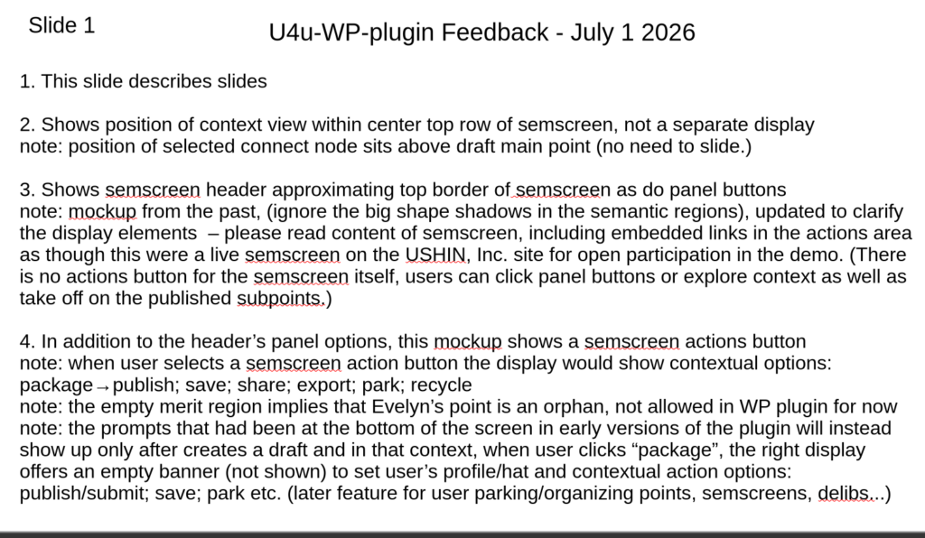
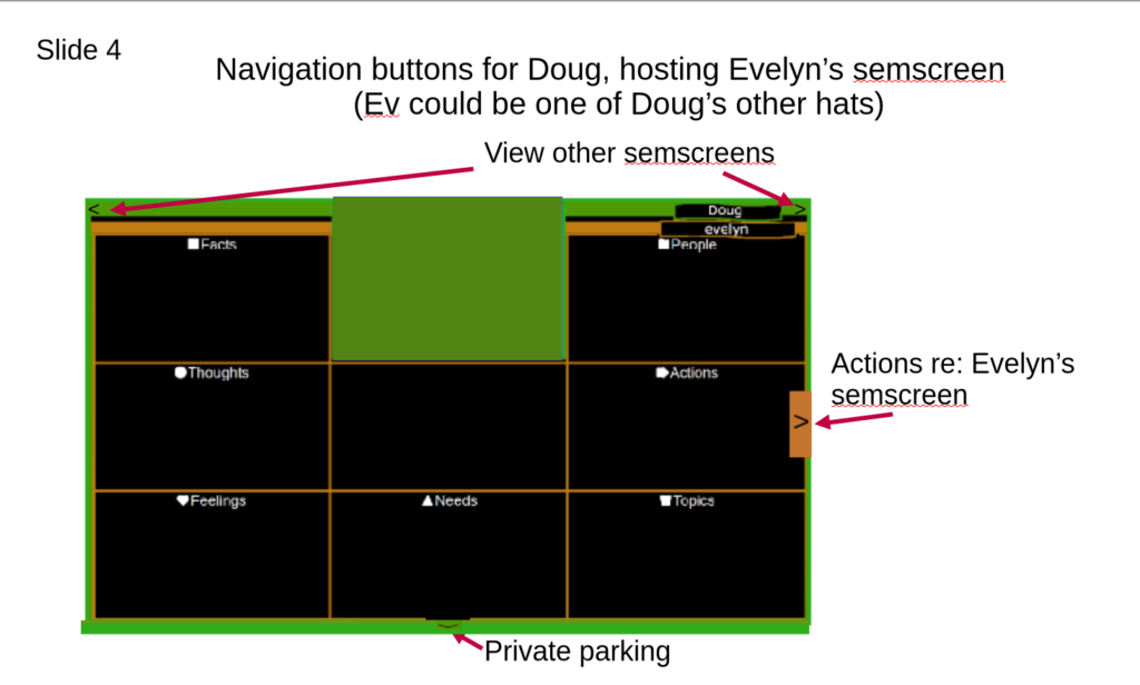
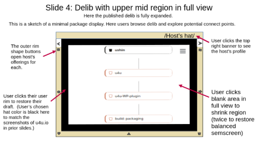
The following Slide 4 is a peek at a potential future feature. The mockup introduces both the author’s semscreen pushed to the rim, and also a host’s rim. Host rim minishapes do not go to the author’s input, but to the host’s input about the shapes. That will be reviewed later as we develop curator options. The view of a host’s icons is useful for new users to the interface and/or a new host.
Note that the rim part of the following mockup was copied from u4few, an example for note taking in groups, where we were calling people/groups’ IDs “hats”.
Note that the yellow rim shows the part of the screen for the host. A WP plugin curator at imbue.im would show its icons for user to see how imbue uses them. The curator will create the sets of possible topics, for example , topics as songs and subpoints about them. There are several display option suggested here that may come up in the future.
DONE
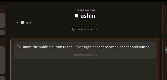
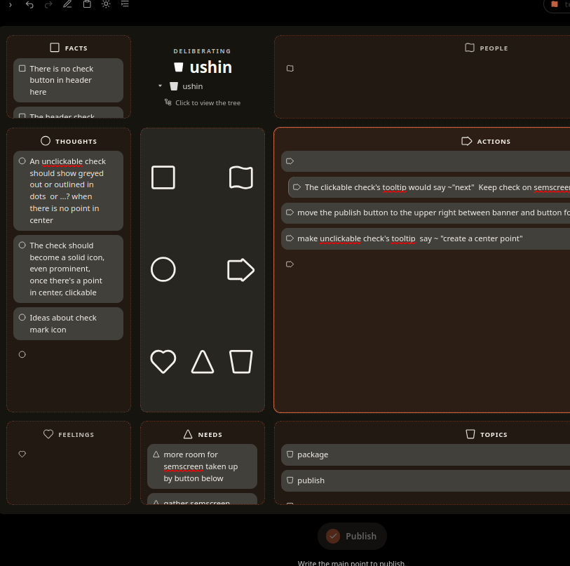
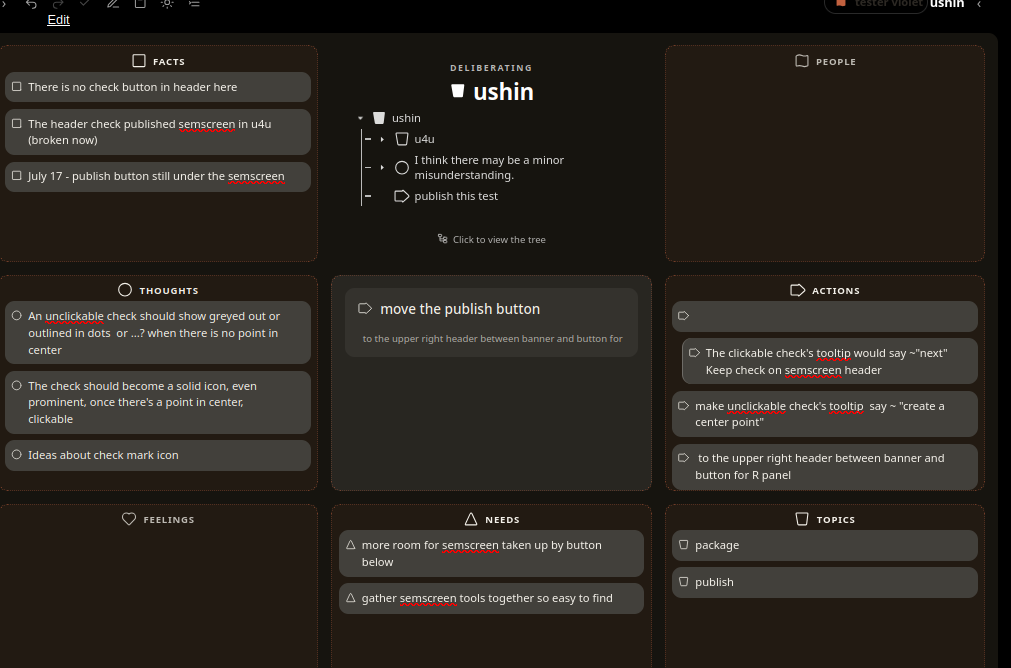
publish button not in header, like u4u.io, with other tools, within the workspace and flow ->move the publish button to the upper right header between banner and button for R panel. Give prominence and real estate to the semscreen
there’s never a blank point, especially on the top of the list – and then only when its the only point and the region is opened (not in balance)
When filtering in right panel for facts only facts appeared, as expected. Filtered for feelings and a feeling showed in the middle. Can the user set the parameters – or have another column appear for date or whatever made the feeling show up in that spot?
BUG: I am able to edit text within text boxes but not getting bullet shape or ability add input to other regions
BUG: Deletion from delib isn’t working
For the purposes of pruning their own delibs, let admins remove points
screen after taking point from middle – to be able to edit it
then deleted it:
and it shows in list:
even on refresh:
and the point remains
BUG and UPDATES – Closed Points
Closed points (on delib and panels) to have the same appearance – see prior slide show
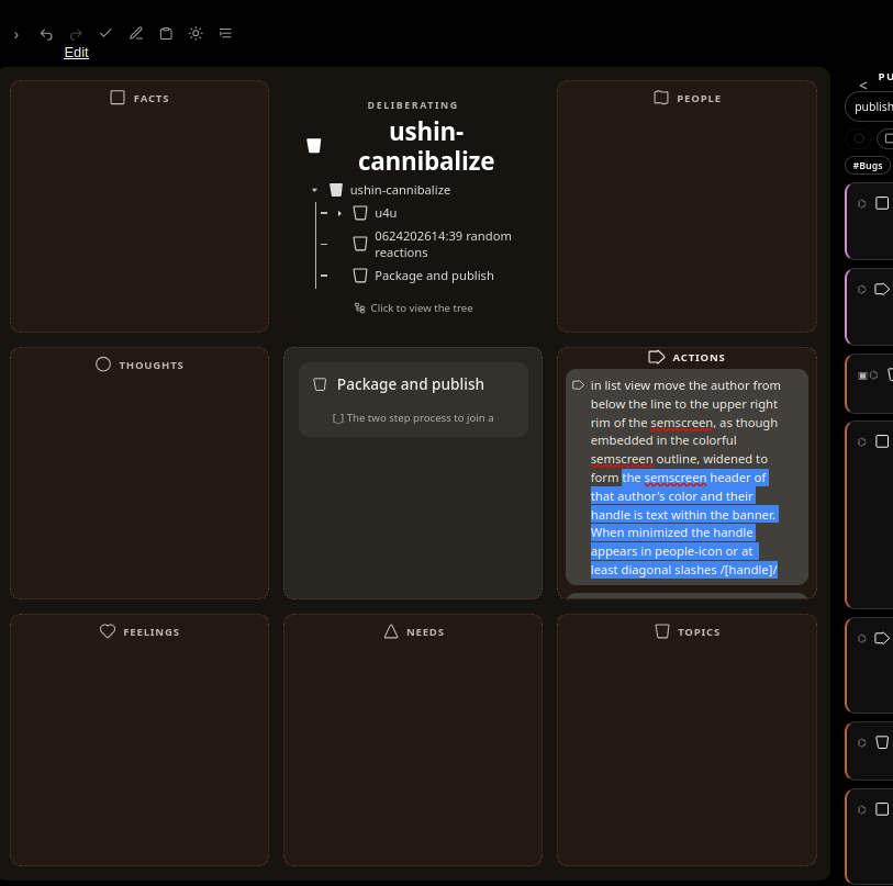
-> in panel list view move the author from below the line to the upper right rim of the semscreen, as though embedded in the colorful semscreen outline, widened to form the semscreen header of that author’s color and their handle is text within the banner. When minimized the handle may be logo/avitar with handle surrounded by diagonal slashes /[handle]/
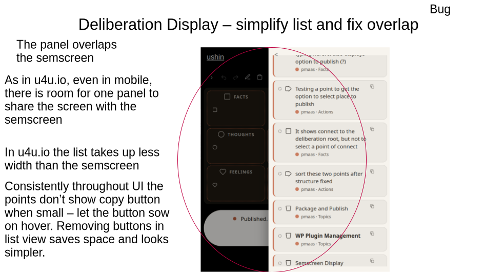
Points wherever they are, lists or delib tree…, have buttons: copy, delete, centralize
change centralize button to four arrows pointing in from corners and sides just part of the arrow shaft, no room for 8 arrowheads in a little icon
The all should have the publish date on the upper left – see prior mockup – that shows when opened,
BUG
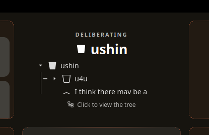
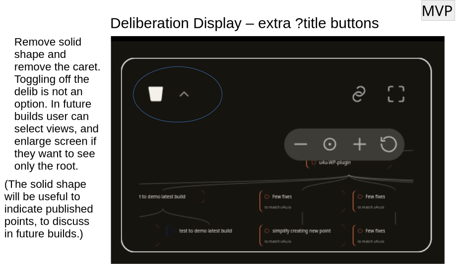
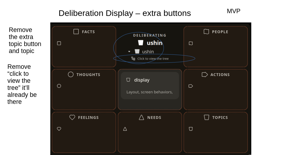
There is still a duplicate of the title and the word “DELIBERATING”
-> just remove everything but the deliberation itself – just the root and descendents in a line to the point in focus below the delib – please see prior slides.
This is a copy of mockup from below:
This is what the delib shows all the time – a straight shot from the top so user knows what’s being deliberated, no need to announce or title or explain what to do. See above, re region tooltip
2 BUGs
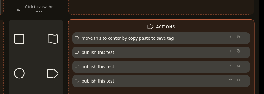
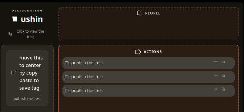
move this to center by copy paste to save tag
BUG
Paste works in byline but not headline
BUG
There is still a view with double roots and persistent word, DELIBERATING ? remove everything but the deliberation itself – remove click to view the tree, too
-> that’s a tooltip for the region that says, “explore”
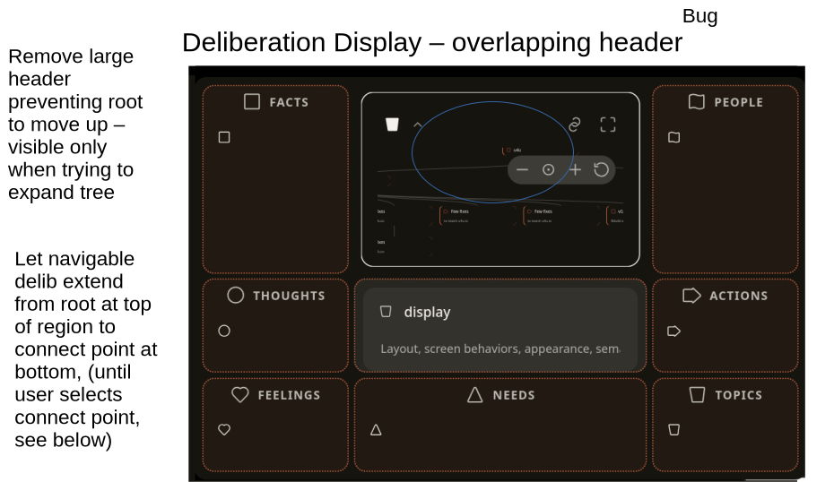
BUG – delib gets cut off at top
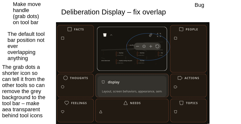
If toolbar is transparent wondering why the delib gets cut off, maybe a buffer ..?
=> try a moveable toolbar that doesn’t cover any of the deliberation
? remove the whole screen icon, unless it does something besides what clicking the screen does
UPDATE – this will improve the navigation experience a lot
? make one row of buttons: not 2: redo then center then – and + next to each other then add a navigator button has arrows pointing out in 4 directions up-down and right-left and when people select it the button enlarges a bit within empty space and user can navigate more easily, also the keyboard arrow buttons do the same thing, move the center of the delib around.
BUGS
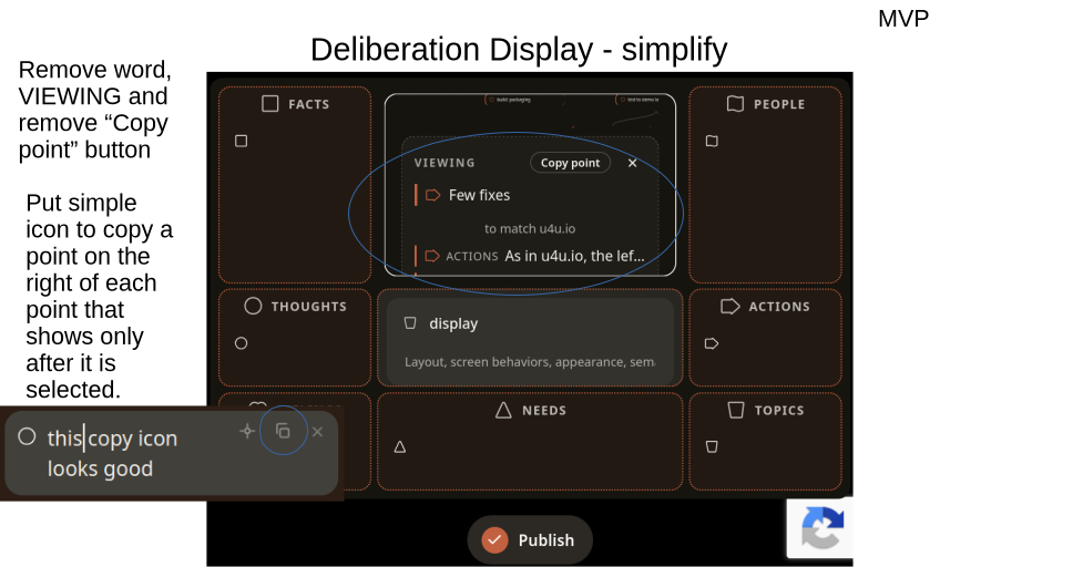
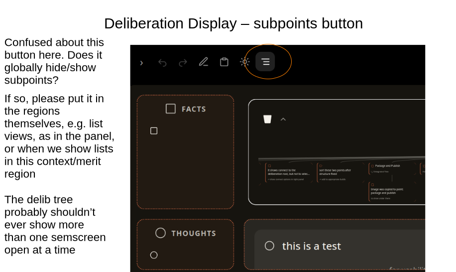
-> remove “copy point” button on the top of the list of subpoints of a selected delib point
-> remove the x to close the view of a selected point instead the user would simply click away to wherever they are going next in the plugin – a benefit of keeping options in view.
-> if “copy point” copies the semscreen then it would be the copy icon with tooltip explaining, copy semscreen
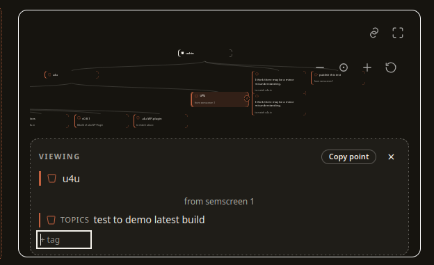
-> it looks like there is a way to enter tags, is that for the whole semscreen? for user to submit?
FUTURE: It will be useful to tag published points and semscreens, but that is more for personal organization at this point … to revisit later.
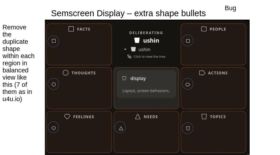
Bug – no shape bullet
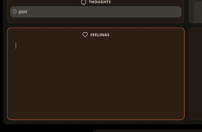
When user clicks on a region the cursor expected to show up to the right of the little shape bullet
BUG
BUG
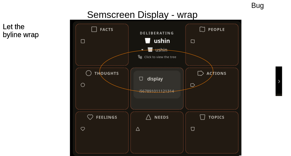
The deliberation point may wrap but the second line pushes the first line away so you can’t read it.
-> when user selects the center region the cursor shows adjacent to selected shape and when the user types after ~? 20 characters in the header the byline pops up and the user keeps typing to see the characters show in the byline
-> let the byline text show from the top beyond the first line until the last character – and maybe follow twitter space limits
BUG – it’s possible to publish the same exact point twice
BUG – indent icon in left panel – at this point we don’t have hierarchical or outline features for list of drafts – this would be a future feature, t.b.d.
-> remove this in the panel, it is good in a region that has indented points but otherwise would not show
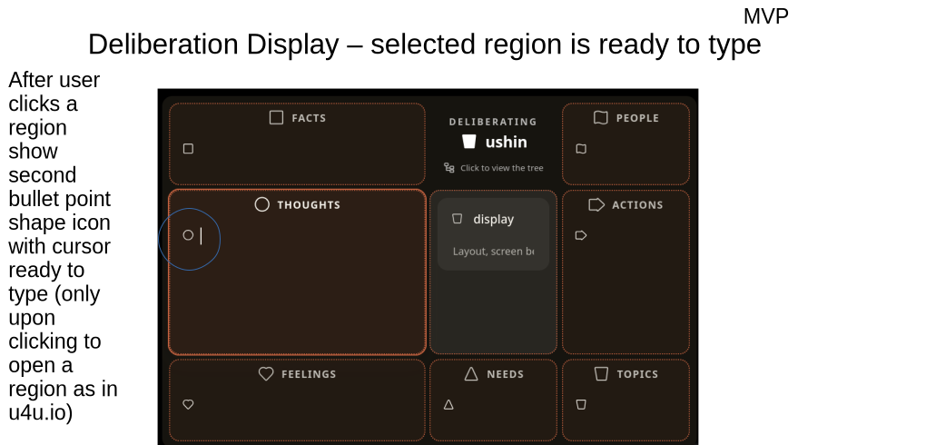
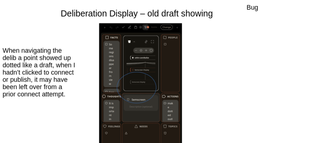
BUG – sometimes clicking on a region in draft displays a bullet with cursor next to it – which is expected, sometimes just the region gets larger without a bullet or cursor, even when clicking a few times
-> fix so every time user clicks a region in draft it opens with bullet shape and cursor
BUG: – the ownership of the semscreen is not clear
The upper middle region is good with a transparent background, it represents the community context of the semscreen, which is the domain of the author and so the entire background – a short fat “U” shape, including the background of the main point – all of that to match the color and intensity of the author.
Here the regions in the periphery show a relatively less intense hue of the author. Is that because the plugin won’t let us customize the background of the board, not just the regions?
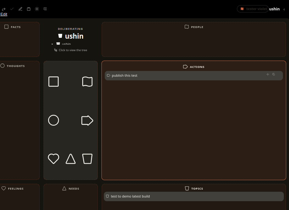
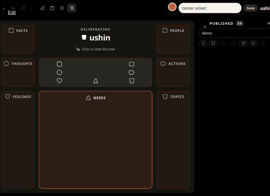
-> Make the background from the header down to the bottom of the semscreen as orange as what tester violet chose (who is color blind i guess) except for the upper middle region that stays black. The purpose is to unify the semscreen as belonging to that author
-> Mockup with background of semscreen in author color
-> regions stay with most readable contrast of font and background, b/w
-> make the author handle be within the upper border,
-> make the header as short as possible
-> put the banner of author as background color to author handle, not just a circle by the handle
-> make the host banner show up as intersection of the author who is hosted by ushin, who is the host of the other published data to be listed under it (not shown in this mockup)
/tester violet/ – see other mockups
This lets the header of the list come up into the same high level as the semscreen header – but the published header is
++++++++++++++++++++++++++++end of July 17 feedback———————
July 16, 2026
2 slides, Click a point
Thank you, Chris!!
——– end of Feedback for July 16 2026 —————-
July 8 -> remove white line
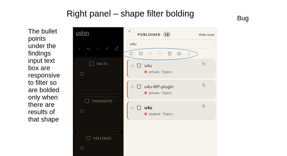
-> grey out shapes when there aren’t any in list of that shape
[] the board overlaps the word Edit
-> hide smaller of two shapes when region is not enlarged.
[] the facts region flickered from this state to open and back when facts was clicked
[] it didn’t flicker when the facts region was open (note message within example)
[] when moving thought to center it got chopped into two small pieces
[] and the second piece was from a prior main point
( ) I was expecting the first few words to show in the first piece and
( ) the rest of the point be like a byline, or second piece (scroll if long) and
( ) I think the outer rim may be in the next milestone
-> avoid repeats when publishing
If \ / ushin is a label of the region please center it and
-> move buttons to be linear, horizontal in upper right corner of region
[] this happened when scrolling inside a region, seems to be enlarging fonts
( ) expected the region would enlarge
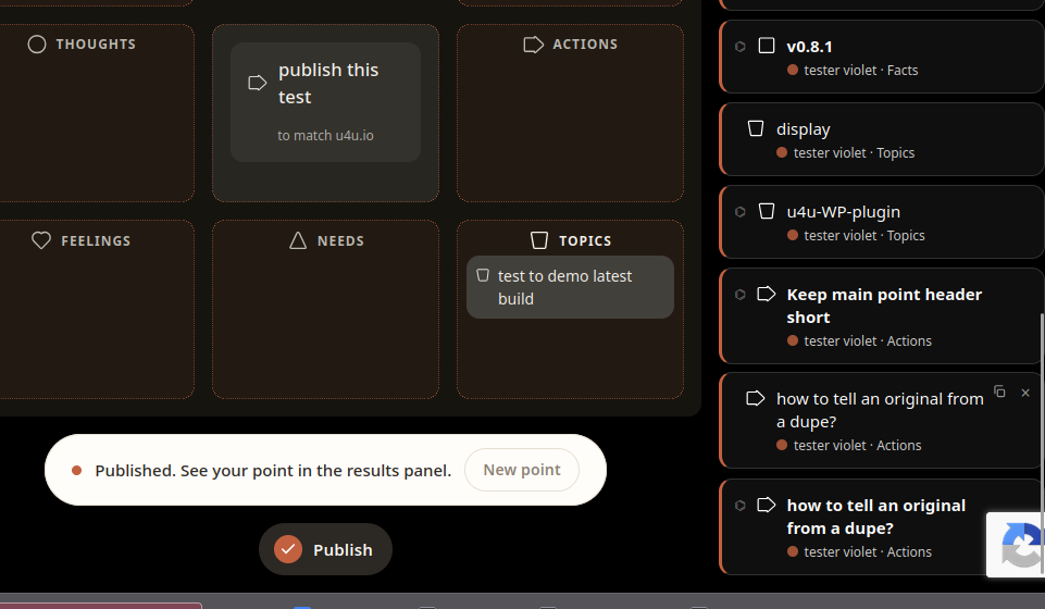
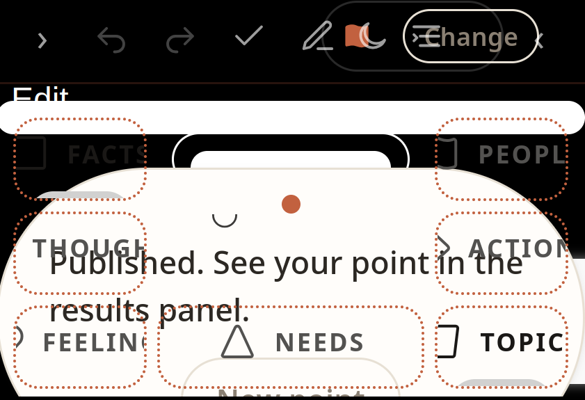
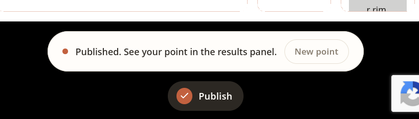
[ ] the current version has “published” pop up and “publish” button on the bottom:
( ) The banner looks slick now
-> next milestone try the user name within the banner shape, so its text within a border which makes a long single-wave flag of the user color – maybe white or grey till user selects a color. See earlier mockups.
( ) i think the groups may have their logo there, and user could upload an avatar or whatever in the future, for now just a color and
–> later we can add patterns and the customization and uploads of logo or avatar
-> make the banner a button opening right panel with the current author profile on top of list of other hats to select and opportunity to create a new hat is a + top right of current author hat
( ) I realize why its important to show semscreens when user clicks a point in a delib – you can’t split up a subpoint from its main point in the interface – the semscreen is sacrosanct.
( ) subpoints lose meaning when not attached to their main point
-> when user clicks point in delib the subpoints appear around that main point, even making the region enlarge to contain it
-> the separate subpoints showing in the delib can show copy option on hover or tap, or even dnd to an open draft or onto a blank semscreen to open a new draft
[ ] the rest of the delib disappeared when clicking the point
-> when user clicks a delib point have it show the entire main point and byline with tags, author, date
-> second click enlarges to show full point and some regions may not be readable (scroll if its a paragraph or more)
>3rd click opens region full screen (up to outer rim) (scroll if nec)
-> keep delib in view, at least siblings and parent, if not grandparent and indicate each generation with a dot if there’s no room to show the lineage beyond root and connect point (+ siblings, and if more show dots on either side)
( ) i like the root showing all the time
( ) I’m not seeing the difference b/t the two circle buttons for zooming
( ) i wonder if the dotted dupe was because i tried to publish twice
[ ] when the point was selected in the delib the display did not show its subpoints until scrolling
( ) too much space and no connect b/w main point and subpoints
-> show the subpoints surrounding the main point in place where you clicked it – like a semscreen within the enlarging context/merit region
NOT SHOWN
( ) not sure if this is necessary in a VIEWING bo if we aren’t going to have subpoints show up in this way in our next build, but
( ) want lines of text to have to the right of the … a “>” user clicks to show the text wrap and the screen enlarge , even with scroll if very long – so you get benefit of beginning of lines as scannable list with an easy way to make the full line readable
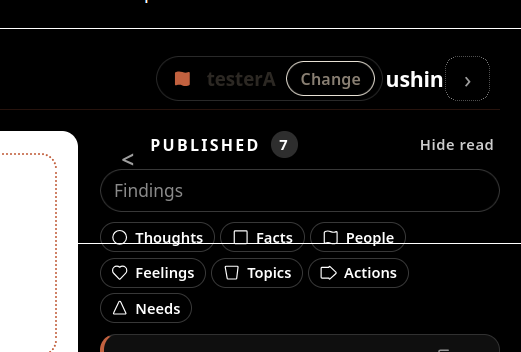
-> remove the shape labels in filter header on right panel, just the shapes themselves in a row – user can see what they mean, or we could have hover-overs if you think they are necessary
( ) the elegant region borders are lovely however the color is subtle when the semscreen is enlarged
-> next milestone: try making the entire background of the semscreen the user’s chosen color such that the regions remain either black or white for content, and the area outside and between the regions is the user’s color; the menu would stay dark, I like that, and it would show up the banner color.
The region outlines stay subtle when the screen size is reduced, too
[] when i finished editing the thoughts regions and clicked on feelings the feelings region enlarged and covered up the other content
() i expected the rest of the semscreen to be as readable as possible
() once the structure is set this would be good to deliberate – it seems there are 2 conflicting rules
regions to expand on click, putting cursor in text box
as much as possible keep semscreen content readable
-> consider indiv points besides the main point offering user headline and byline
DONE
connect points, including roots to be selected on the delib
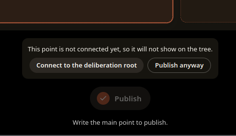
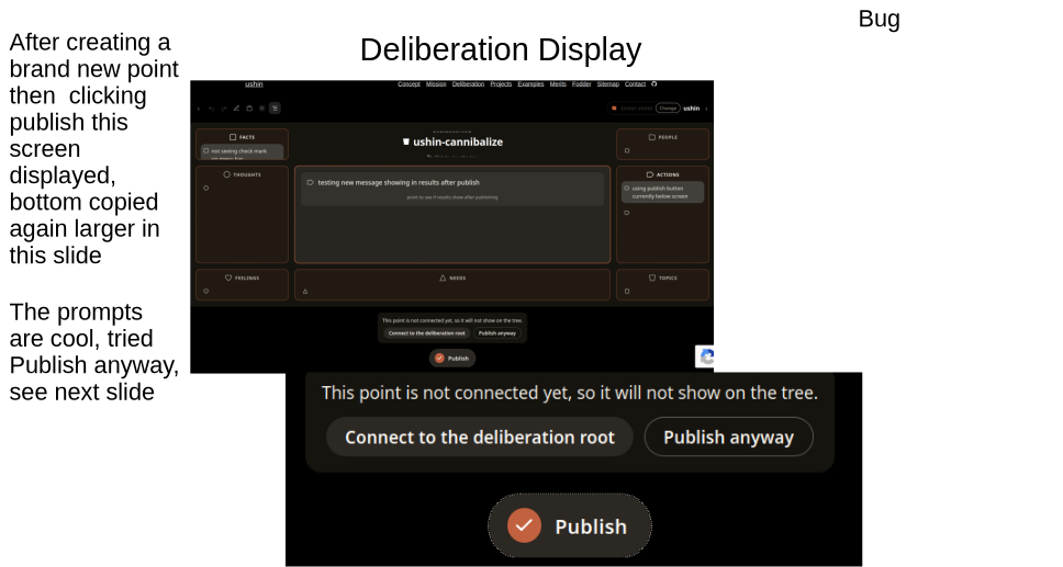
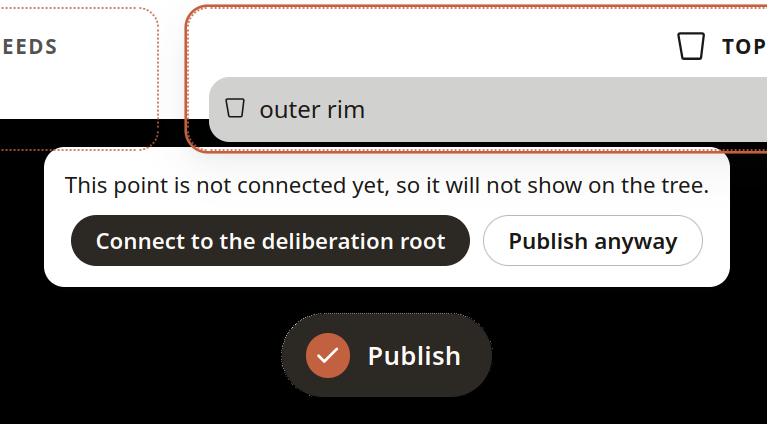
“publish anyway” would be clarified – as save, export, share …
() The connect button is a great idea – since clicking on the point would open it, not cause a connection.
() thinking we could deliberate how this might appear – in this verion the point is hinted at immediately under the connect point and then again in adjacent main point of draft, no need for the duplication
() once the list view of subpoints is changed to a semscreen with the main point larger we can see if the main points in both the connecting and draft semscreens will be approximated enough to show a relationship
() wonder if a labeled arrow from the main point of the connect semscreen (opened in context/merit region) to the main point of the draft (opened in adjacent region below), both flanked by draft subpoints
() we do not necessary want to juxtapose subpoints, just the main points (remember if user wants to connect to a subpoint they have to make a new semscreen, which will be linked to the main point where it originated.
() i’d like to see this implemented or mocked up in the next metric
and – including he banner and I hesitate to make them thicker because I want to maximize area for content.
END OF JULY 9 feedback for now – to continue later
Slide mockups for plugin development
New deck:
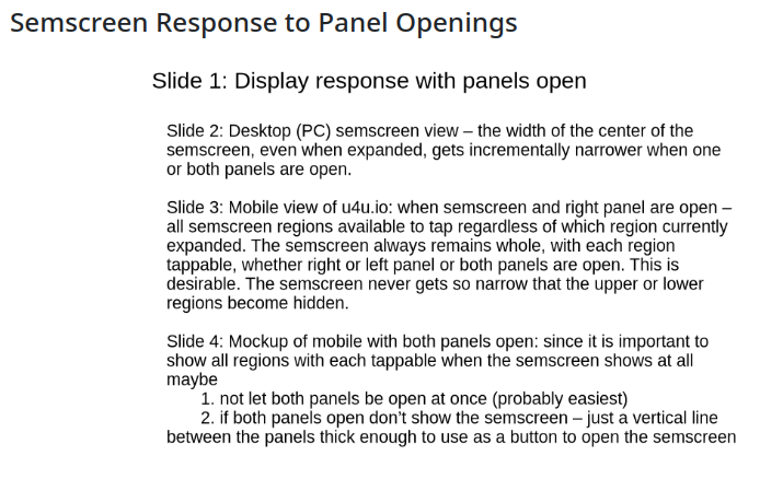
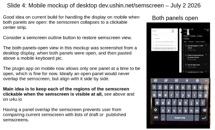
Semscreen Response to Panel Openings
New deck July 2, 2026:
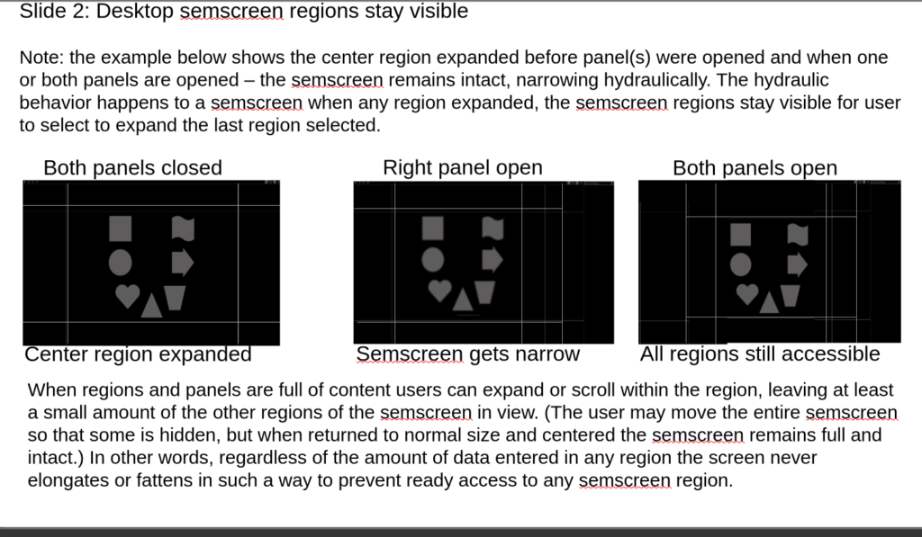
Semscreen region resizing – e.g. upper mid
4 slides incl this one
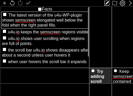
Semscreen elongation bug
-> try limiting the right panel content after so many points and offer a scrolling handle
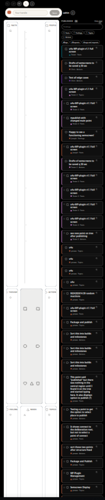
Screenshot u4u.io on desktop
See content of screenshot:
Remember – future features here just to show need for intact semscreen going forward – ignore the part about pasted images, a feature of a separate plugin. Note: whole semscreen view is needed in the modular interface.
End of slides about the plugin for now.
2. Deliberating a song’s speed – NEW FEATURES – SEMSCREEN INTERFACE
The following slides show a mockup of a deliberation about a song. Deliberations to be hosted by a collaborative docu-musical website, Imbue.im which is experimenting with upcoming online ushin deliberation tools.
The deliberation features will extend the interface modeled by the browser app u4u.io.
Starting an ushin deliberation
Mockup: Starting deliberation about a song
Using a semscreen to create, edit and submit for publication
Replying to a published semscreen on the same site
The iteration of u4u (4u.io) demonstrated a return of filtered lists of results. These were saved on user’s browser and made available to others through the p2p, holepunch. When holepunch protocols changed the team decided to consider a more stable protocol and meanwhile focus on developing new features as a portable interface. We will return to the public p2p browser app once the interface is working well as a WordPress plugin, see above.
u4u bug
The website, u4u.io, currently is having “backend” issues and now demonstrates only a semantic screen interface without saving semscreens.
u4u.io did not yet include the ability to make and view connections in a display useful for deliberation.
4. USHIN ANNOTATION
This example allows users to tag content on a text document. It was demonstrated with the emacs example and is planned for a demonstration to tag an online page. This will be simiilar to existing annotation systems but add the ushin shapes to be readable on semscreen apps as well as in the results list on the annotation display.
Bringing us back to the medical issues which inspired the ushin system, the team is considering deliberating a compound for human use.
DMSO was recently evaluated by a physician in his blog with copious citations.
The results to show on shape-tagged semscreens built around a root topic, DMSO. For ease this will start with ushering one readily-cited document, “Ushering DMSO”, using the u4u.io instance and other ushin tools as they develop. The topic was selected as a test topic because it is an emergent concern with a single source holding adequate citations to online deliberation tools. The team is also new to the topic, so will be adding no original content beyond ushering existing content from a recent. Once ready, the team will invite community participation to publish your own points and queries with open deliberation.
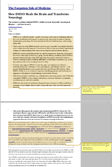
Annotate blog content with ushin tags
The image demonstrates simple annotation, using Libre Office Draw, without ushin shapes. Until there is ushin software to annotate with shapes our process to mock up the example will be to copy the text into u4u.io for tagging.
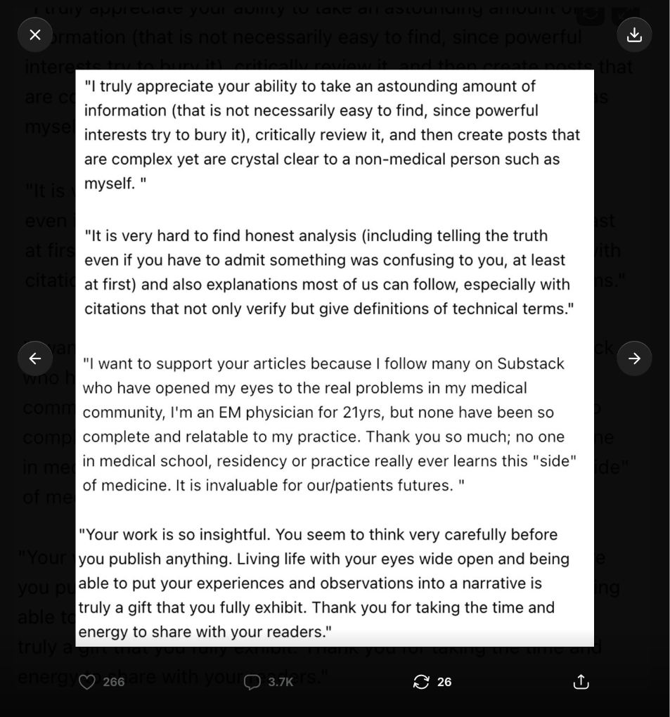
The following sreenshot shows a handful of typical blog testimonials found on the site, which supplement numerous kudos awarded this author and publisher of rigorously scientific analyses and heartful introspection: